



























Ghișeul.ro
Rebranding
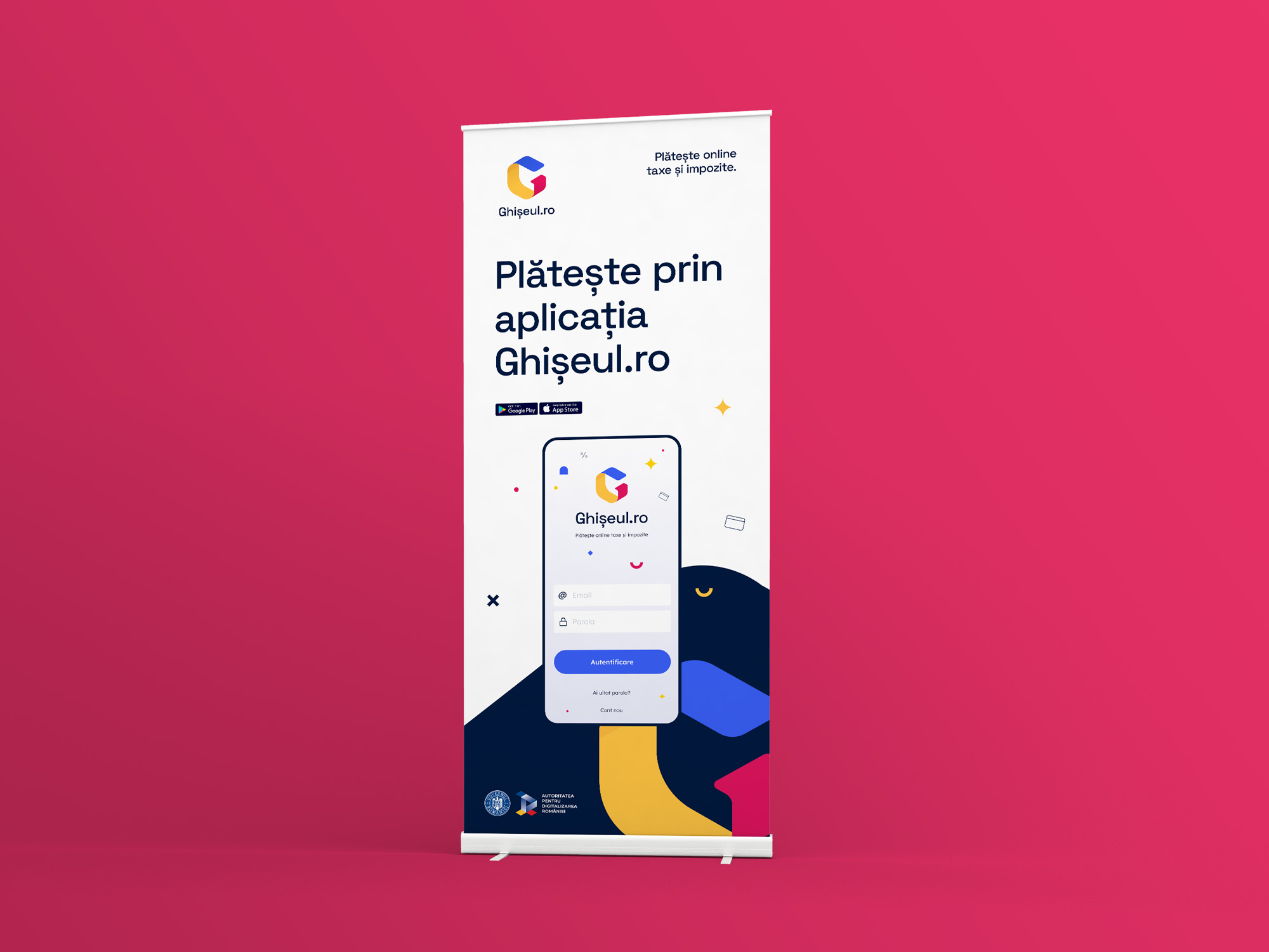
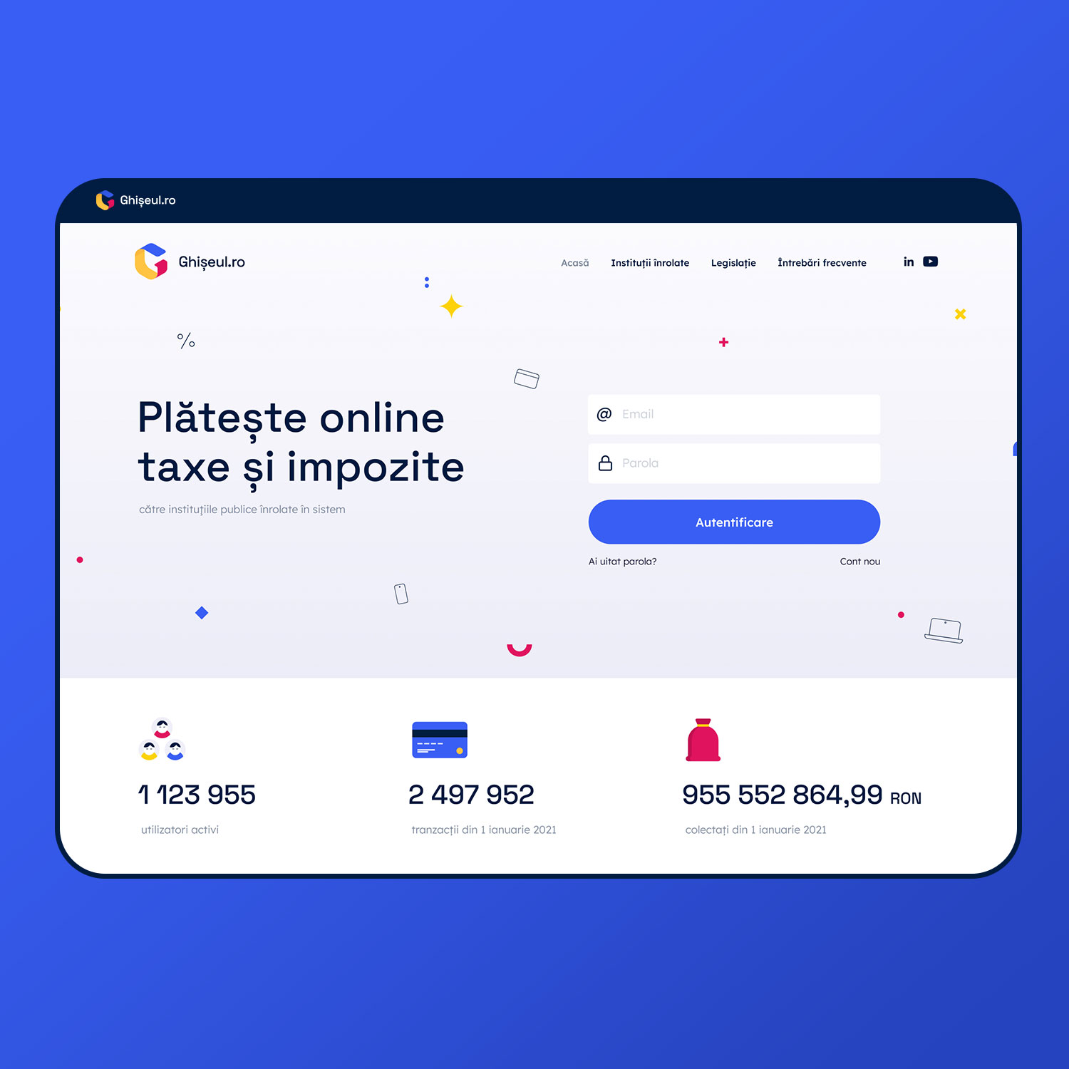
In December 2021, the Romanian Authority for Digitalization held a public contest to rebrand the official Romanian website for tax and other State payments, ghiseul.ro. The objective of the rebranding was to modernize the look and feel of the service in light of the upcoming mobile app they would launch.
My proposal was chosen as the winner, among 400 other submissions.
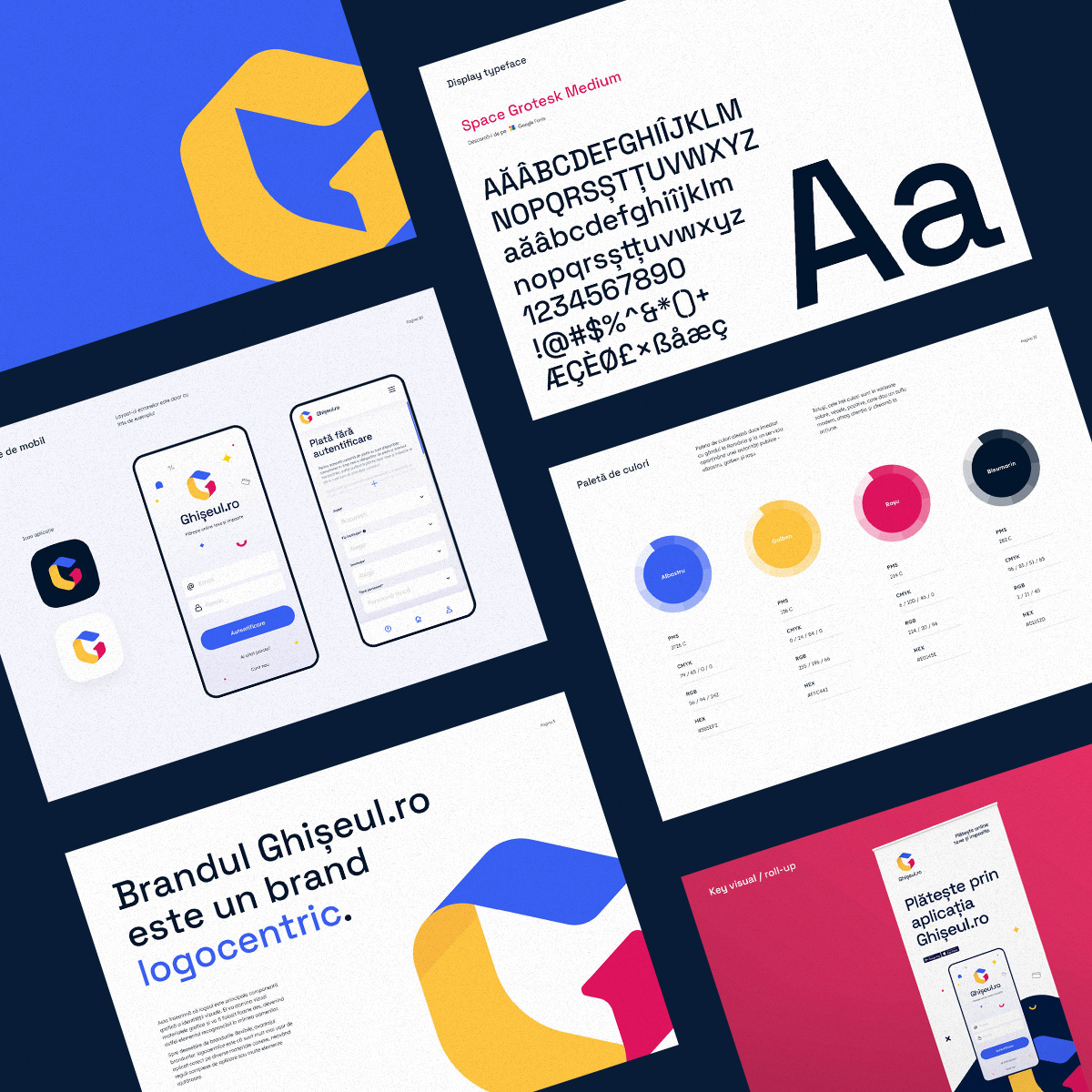
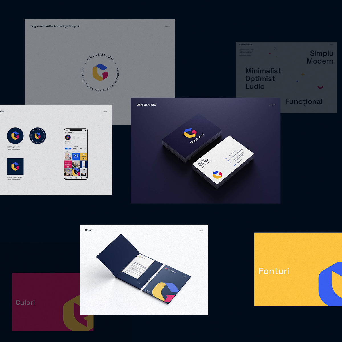
I wanted to align the brand aesthetic with the visual trends of modern fintech apps.
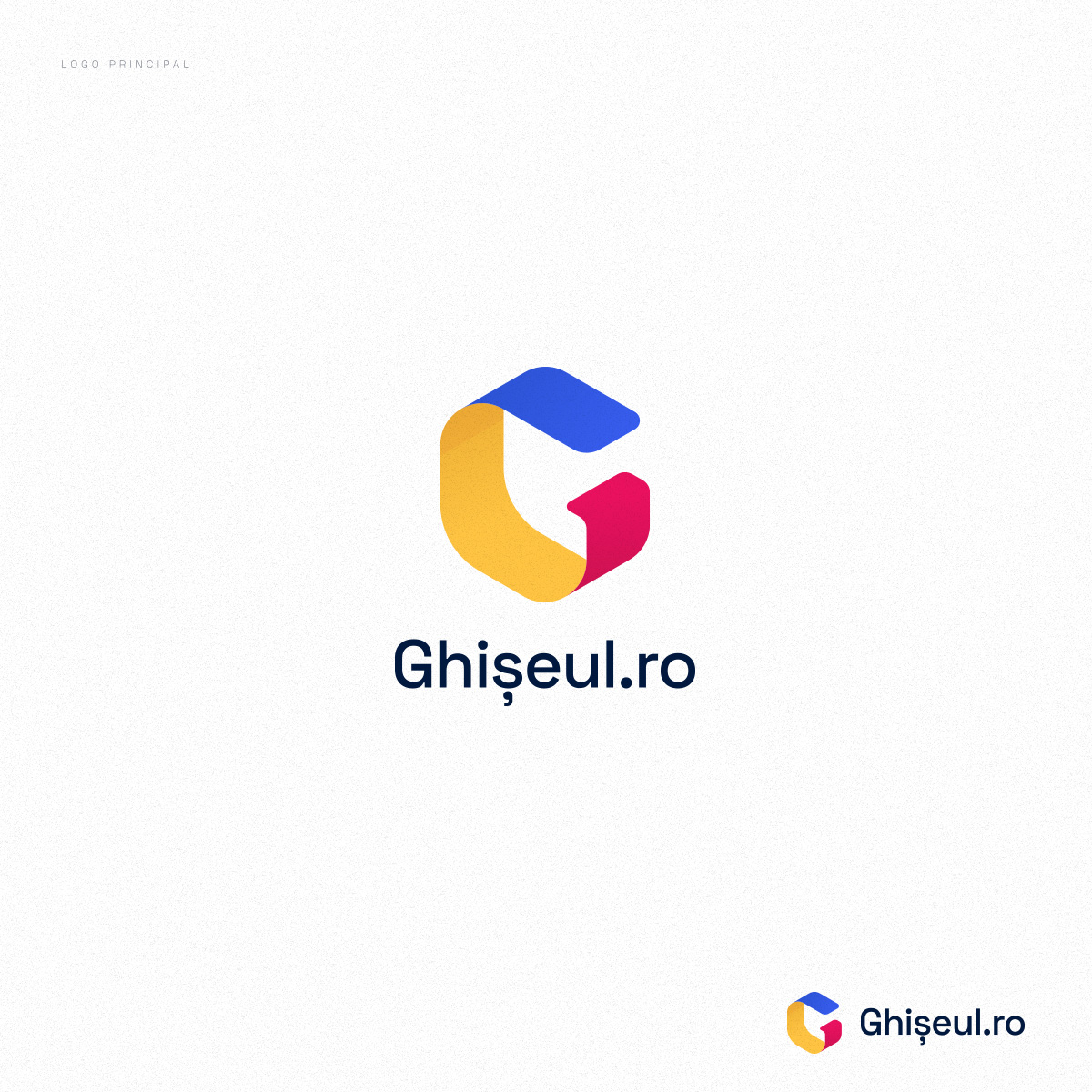
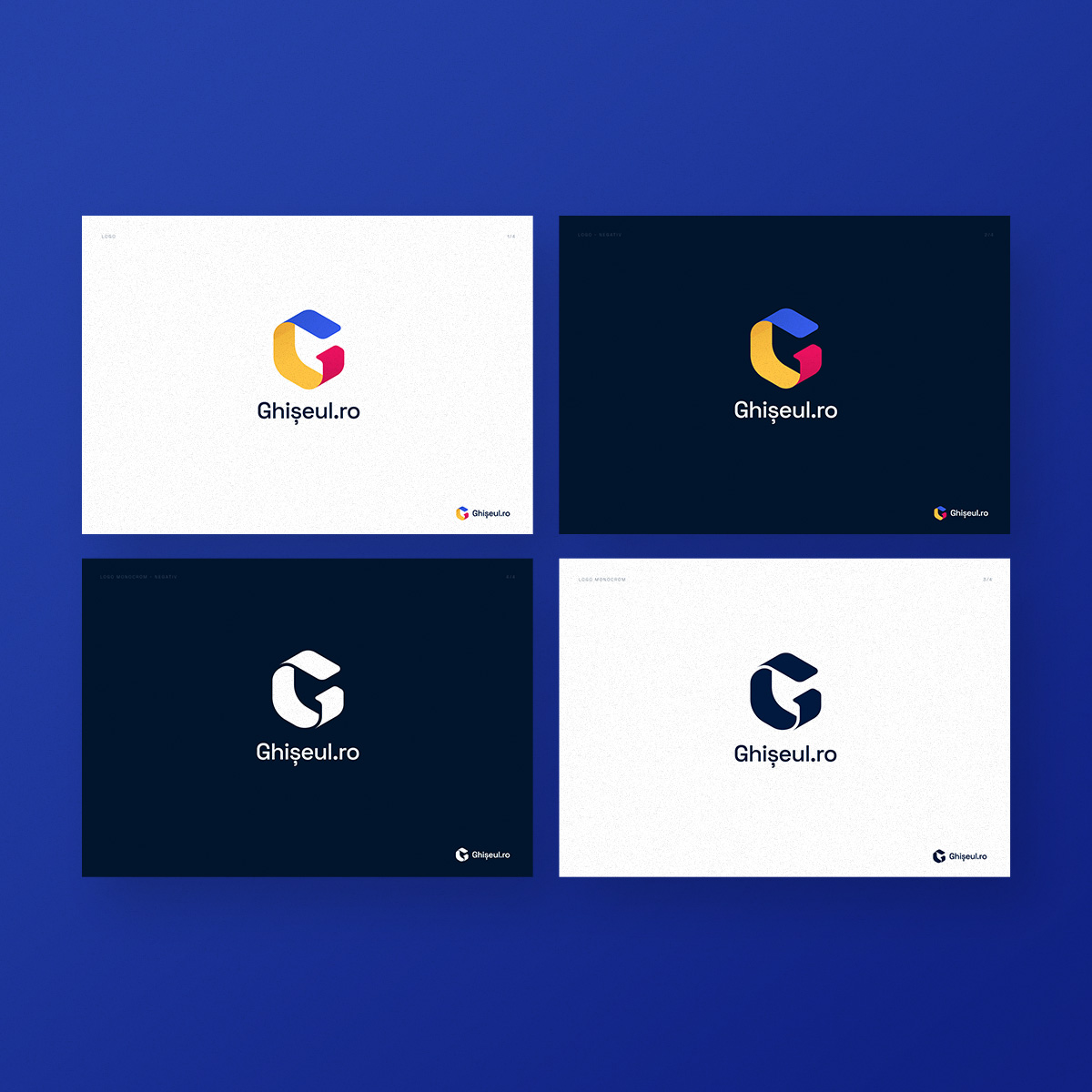
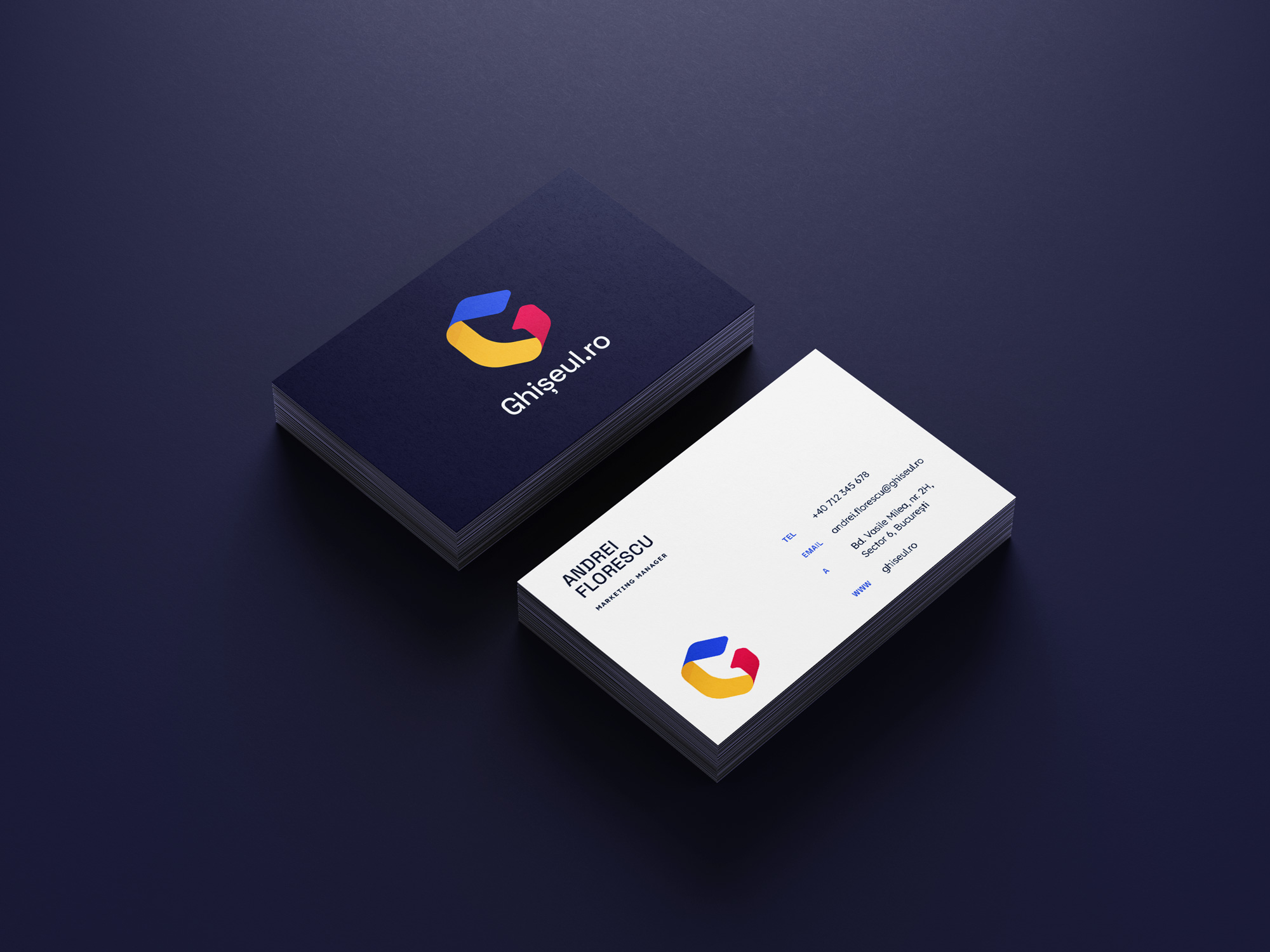
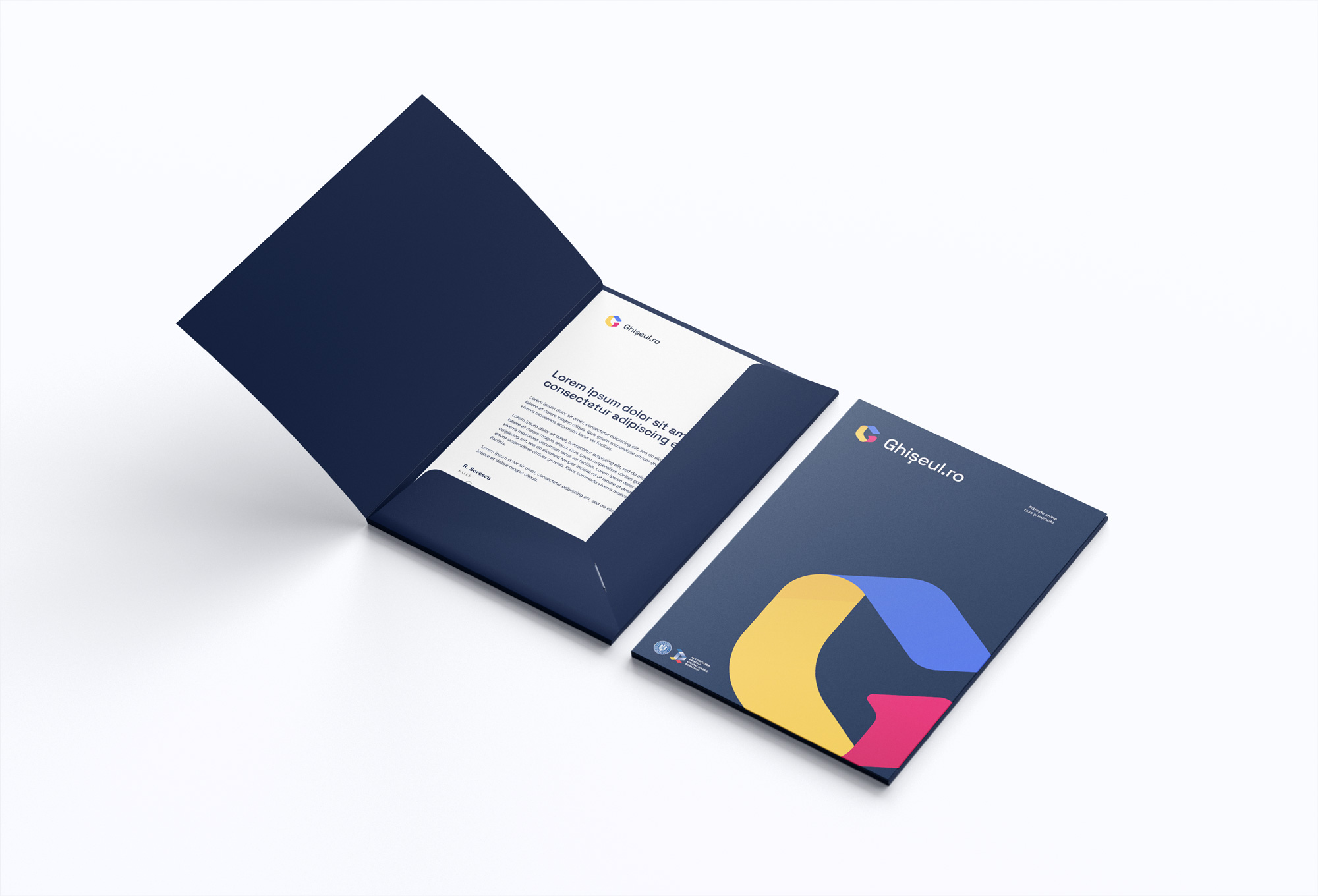
The logo is a stylization of a counter (ghiseu = counter) in the shape of the letter G. It’s minimalist and easy to apply to any material or surface.
I chose to keep the „national” chromatic (blue, yellow, red), so that it’s obvious to anyone that it is a national service, but the colour tones are saturated and fresh.
Telerenta
Branding, website
Telerenta is a company that offers electronics and home appliances rental services – televisions, game consoles, phones, etc.
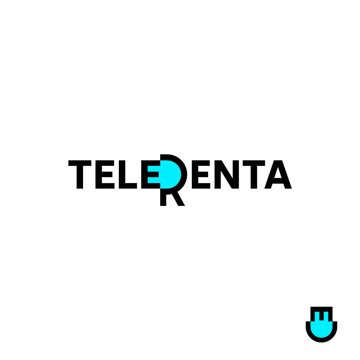
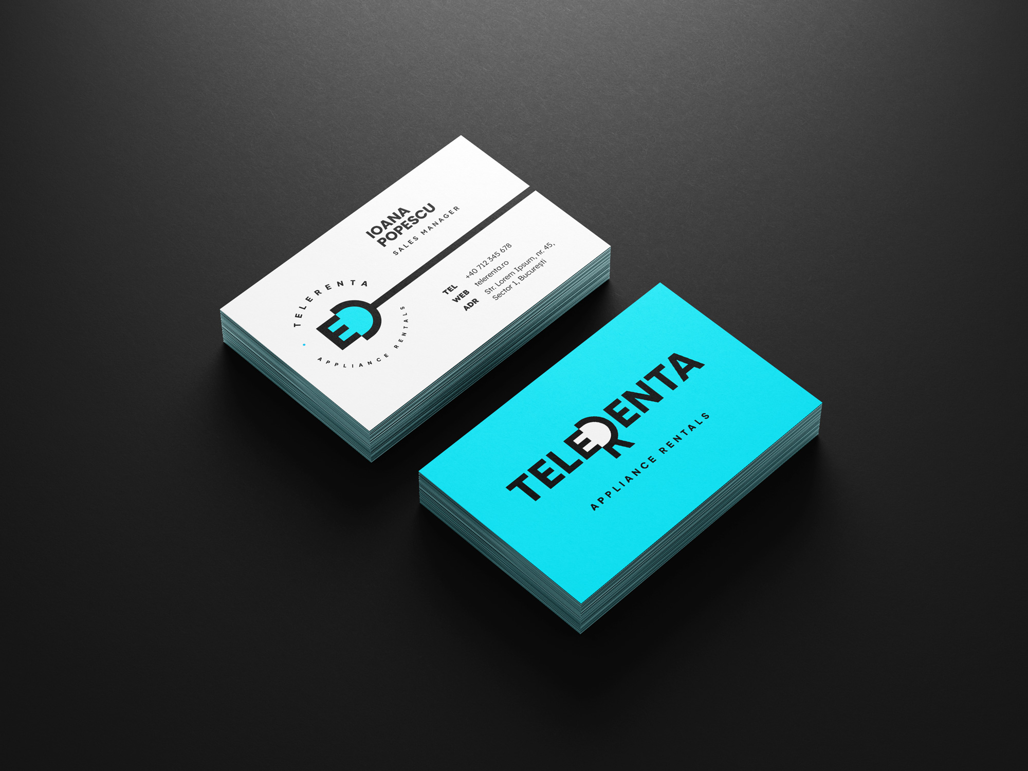
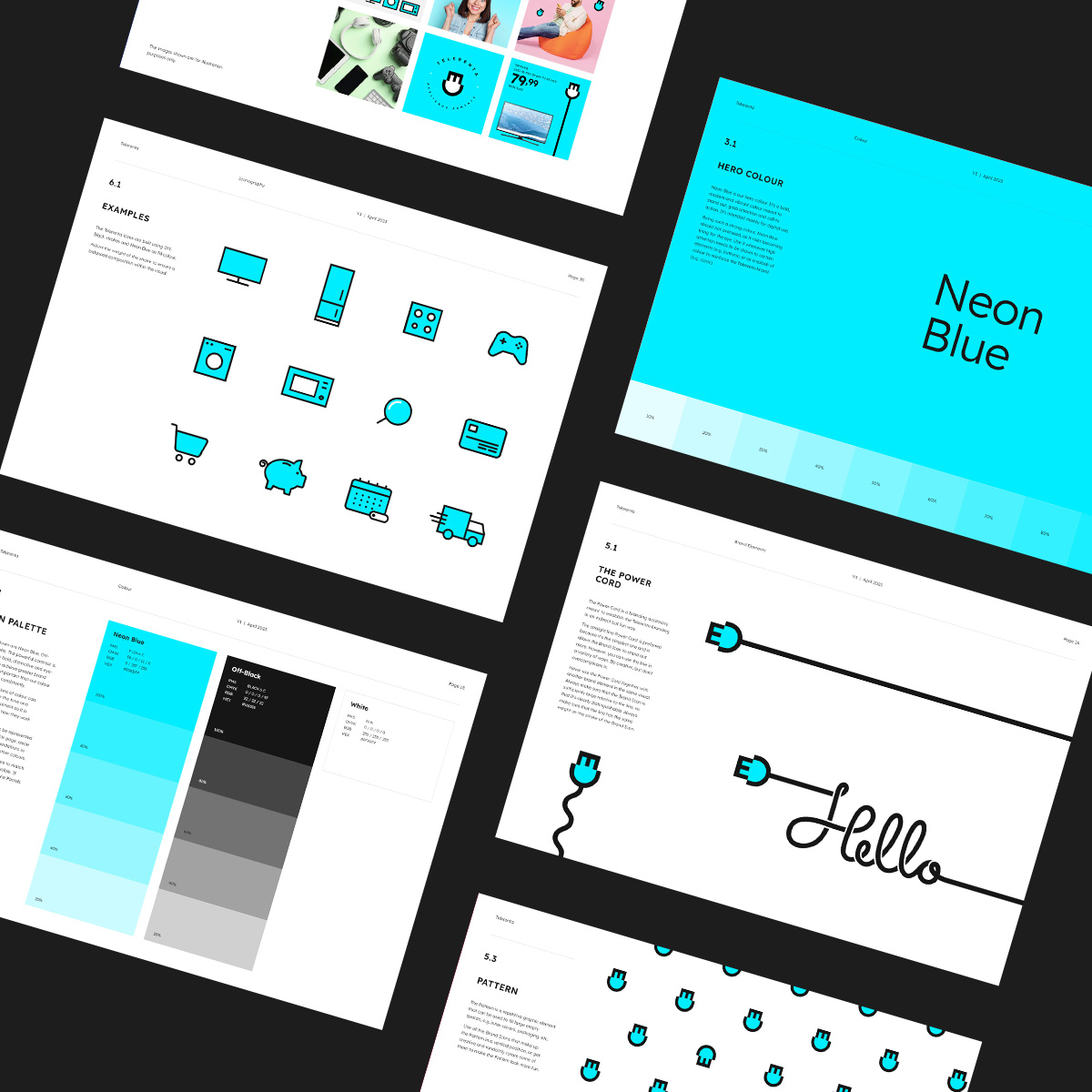
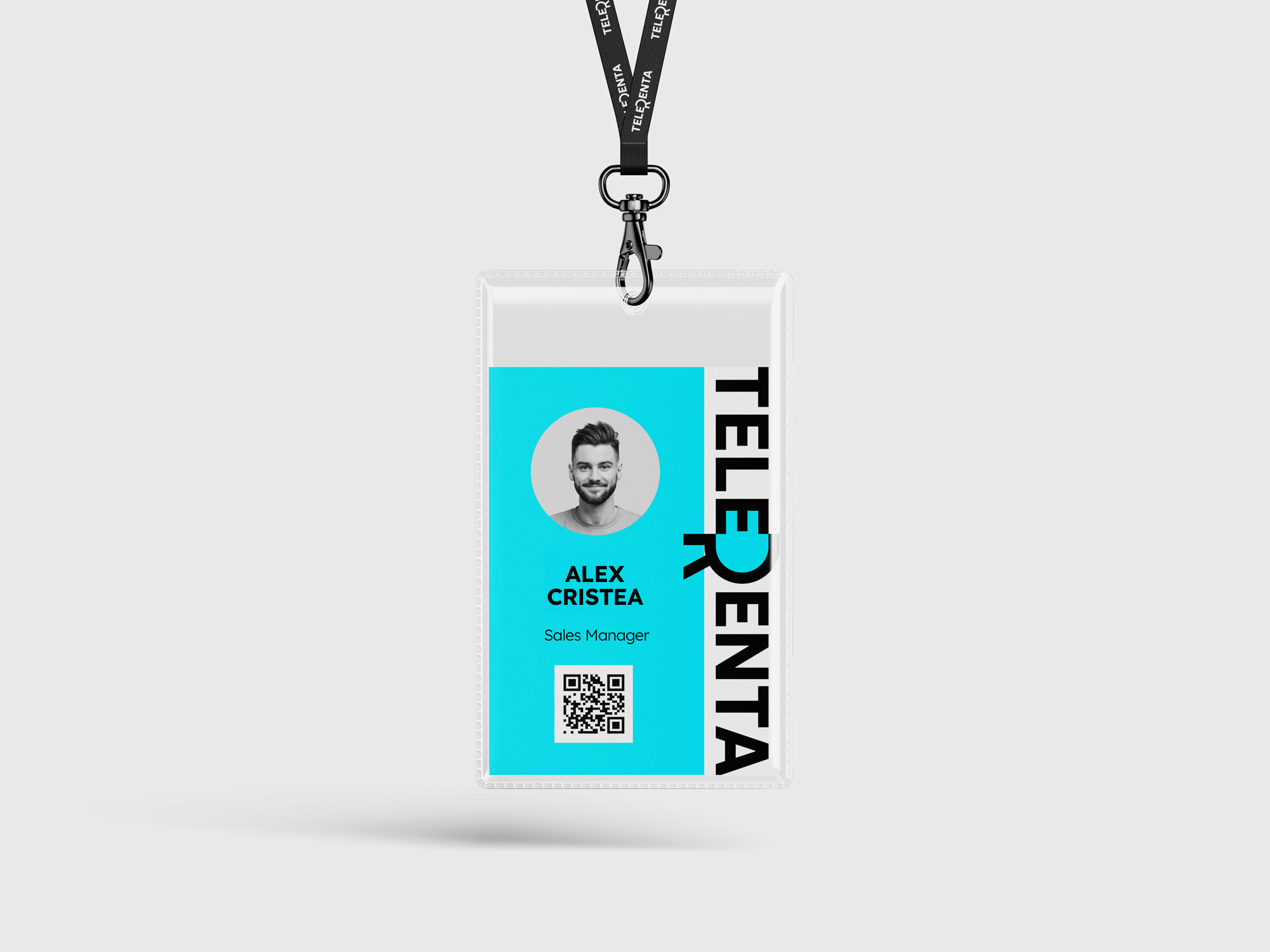
Through branding, they wanted to project a serious, techie, reliable image, of technology specialists, but accessible and easy-going, given the B2C orientation. To this end, I aimed for the logo to be simple with a twist. The result was a simple, yet witty logotype, which subtly frames – in the negative space formed by the letters E and R – the shape of a plug, as a symbol for electronics. The plug may not be visible at first glance, but when it is deciphered it creates an „aha” moment that makes it memorable.
The color palette is simple, based on a single hero color that becomes a brand vehicle – a vibrant neon blue, specific to displays or home appliance lighting.
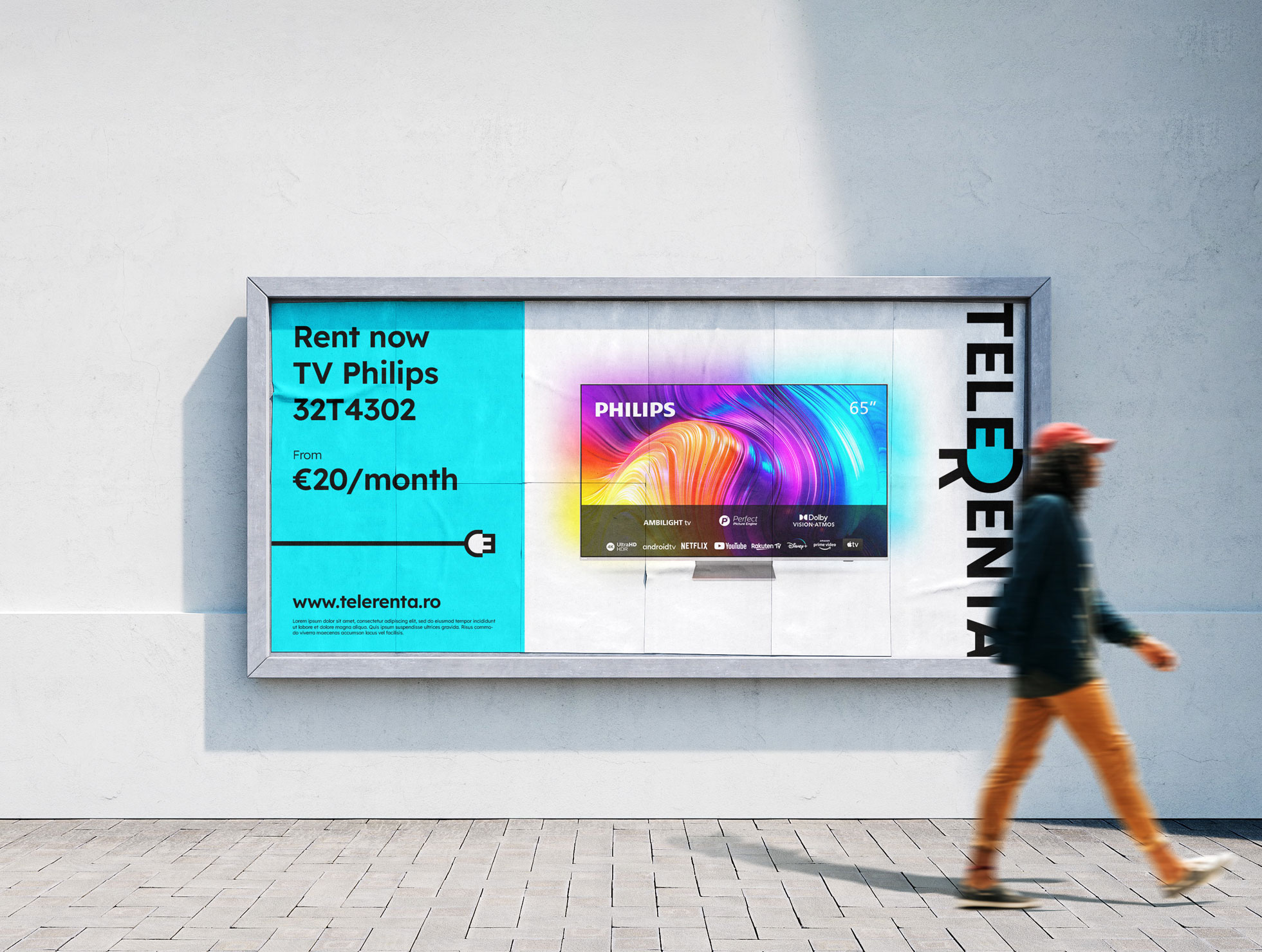
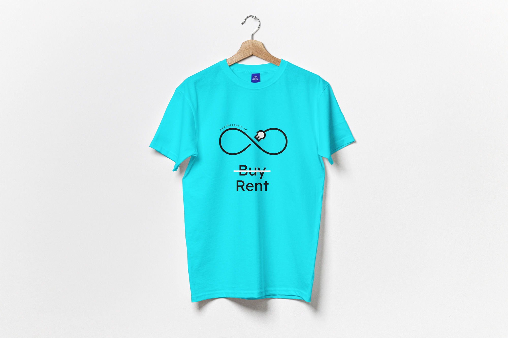
The design system has as its central element the plug, which we use in creative ways to frame or mark various information.
Dreams Montessori
Branding
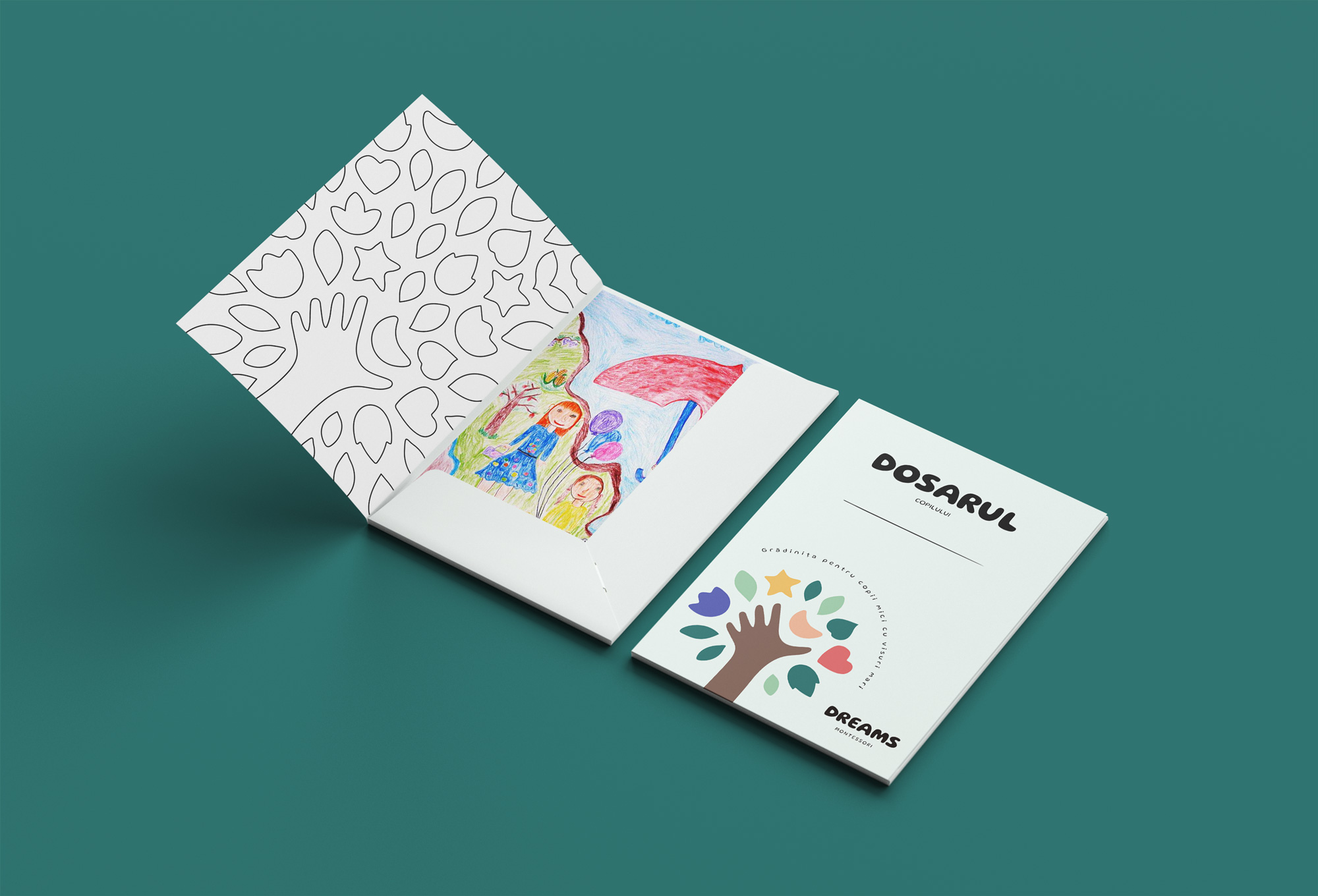
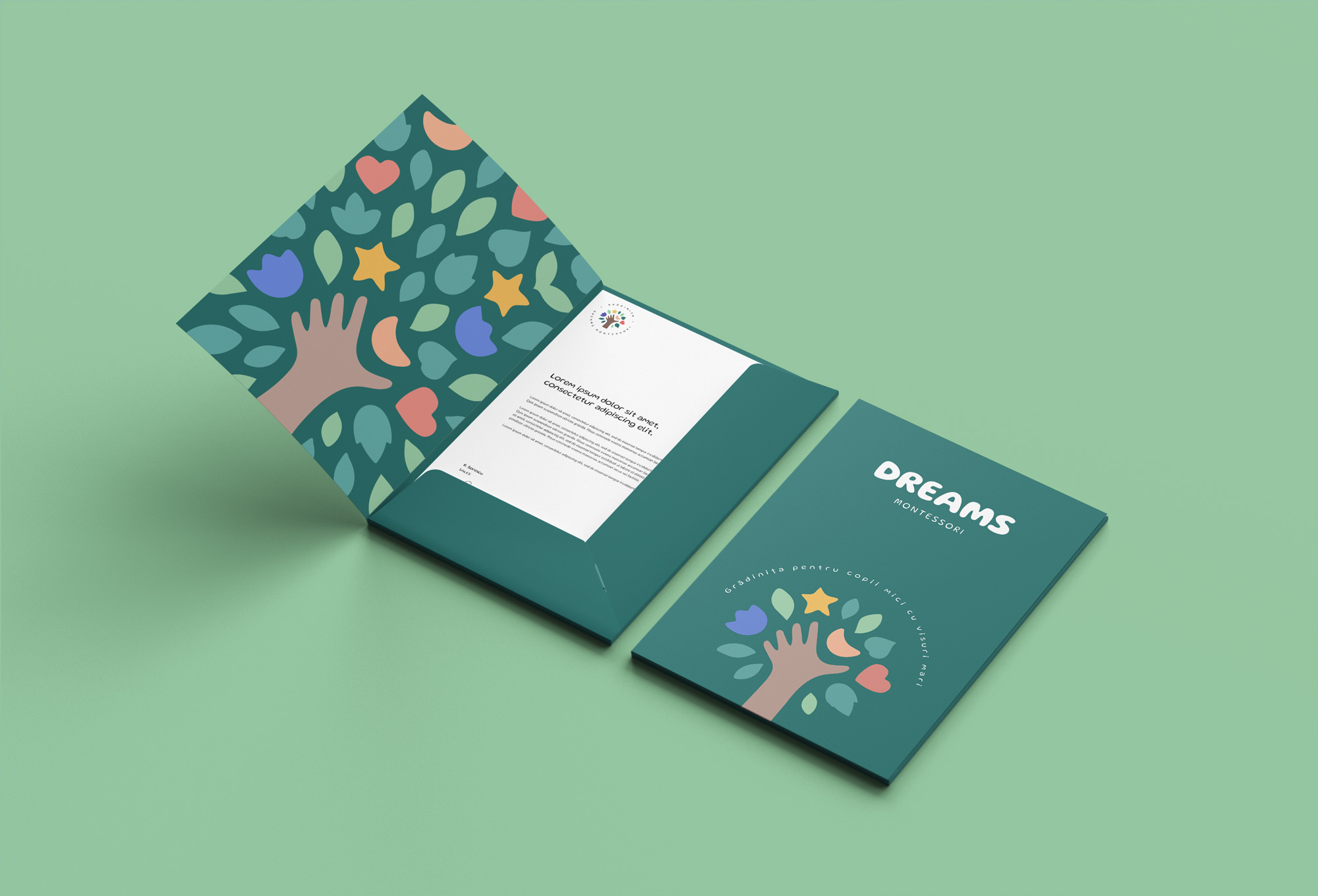
Dreams Montessori is a Montessori kindergarten.
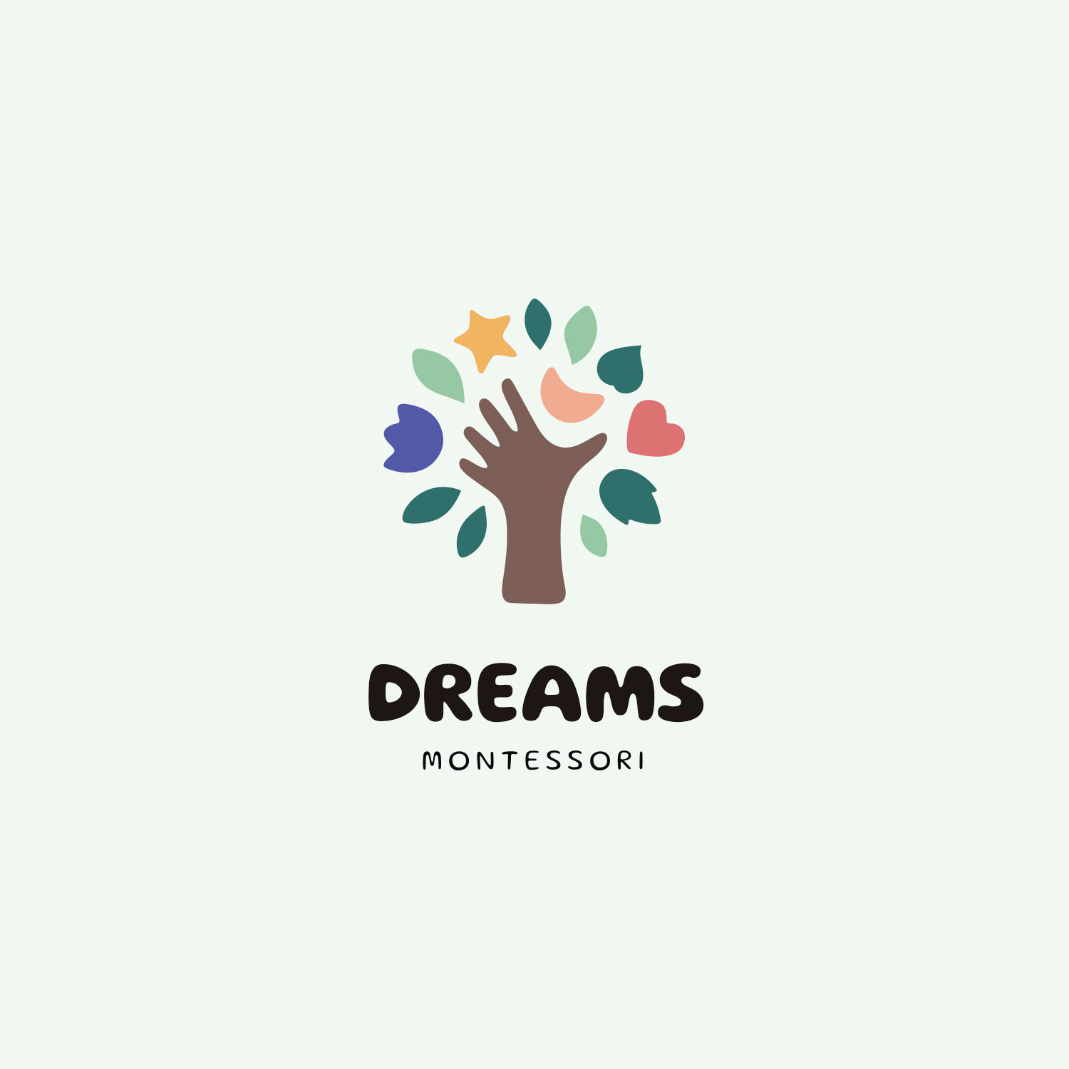
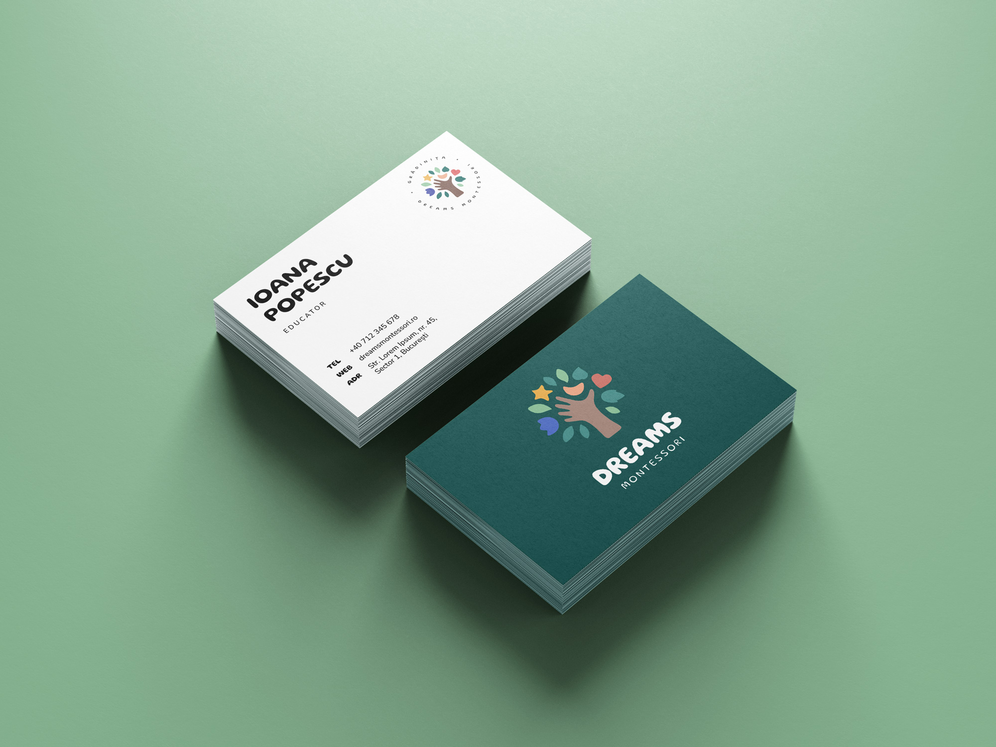
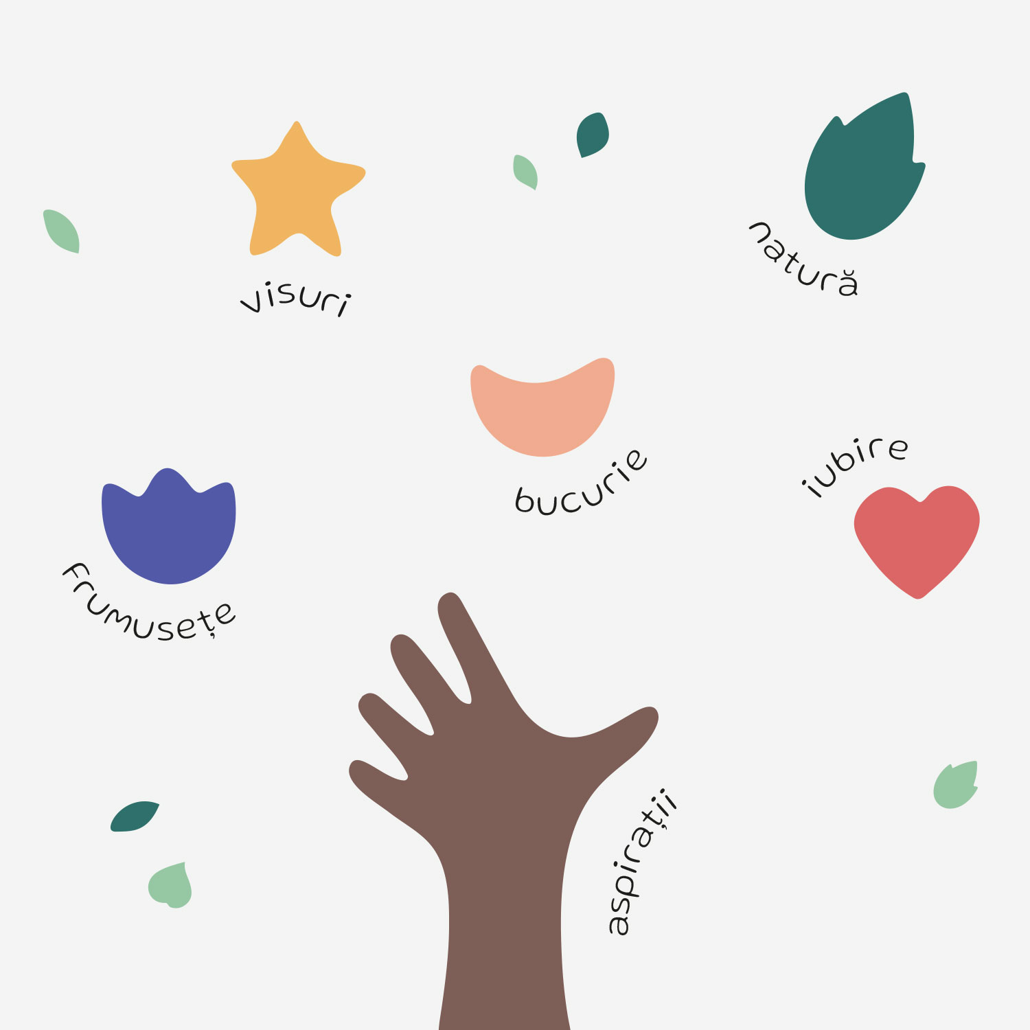
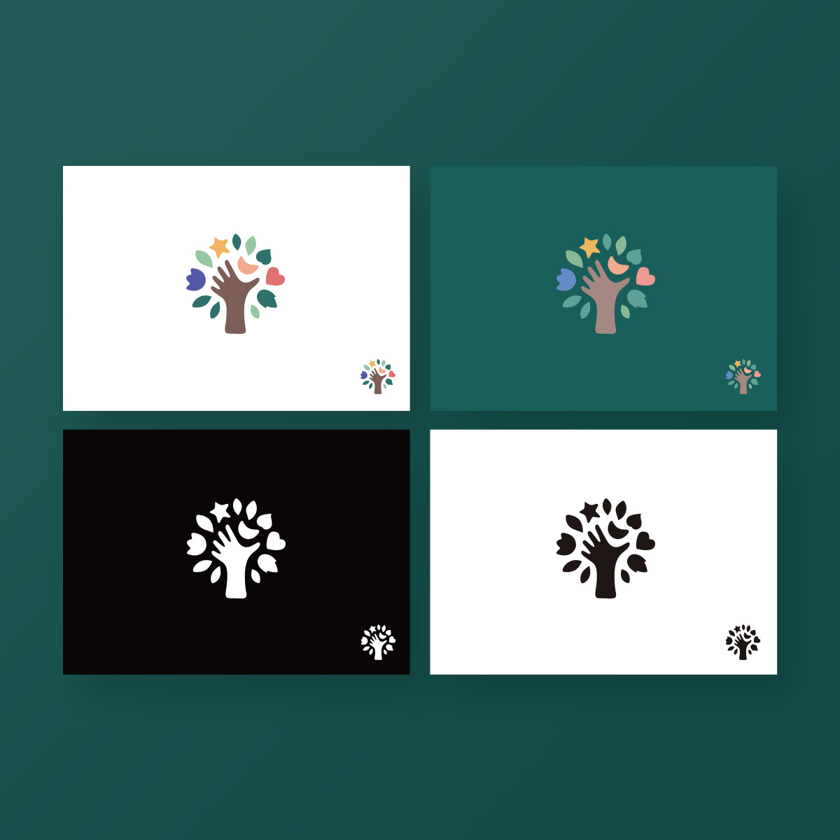
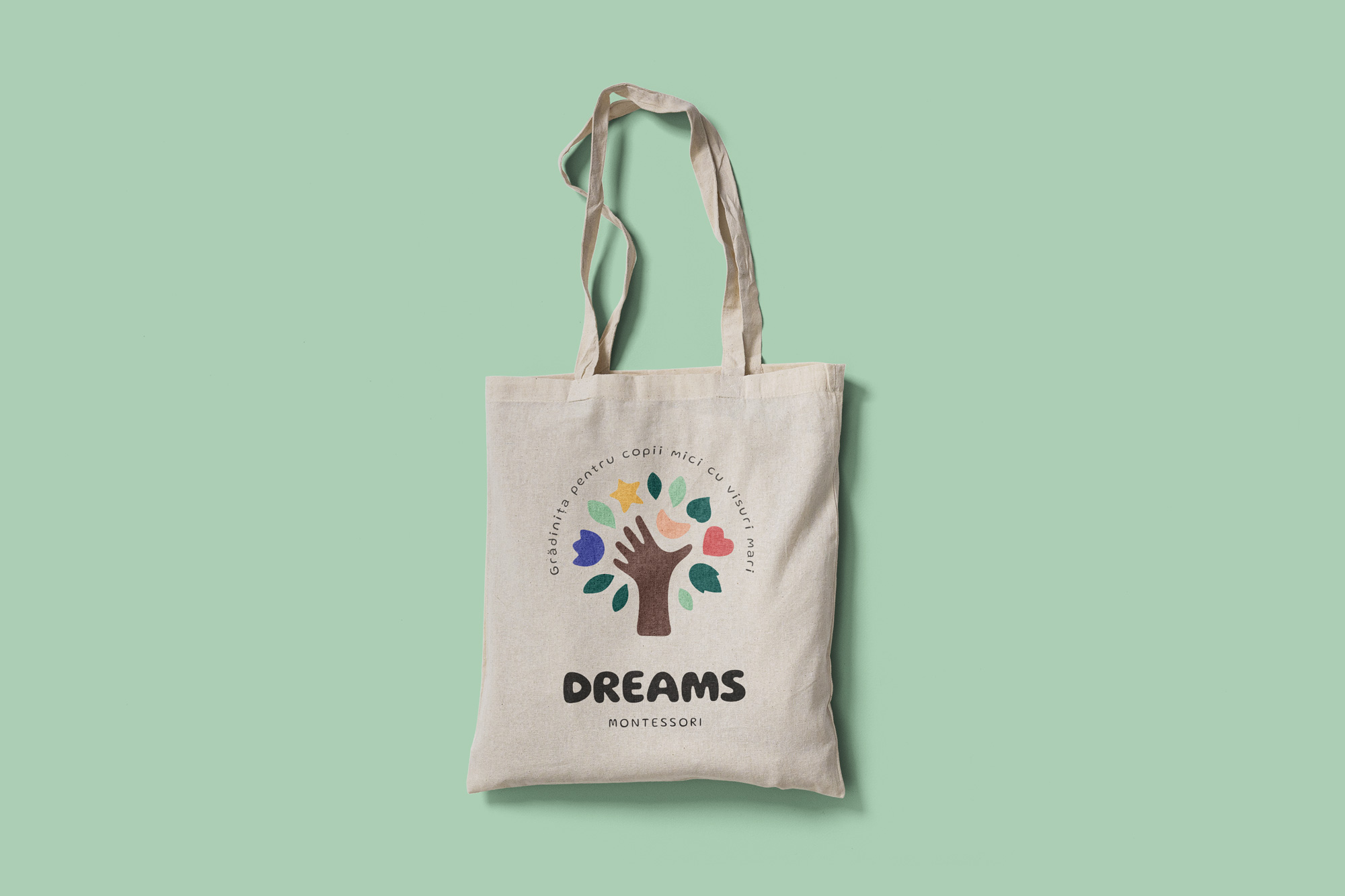
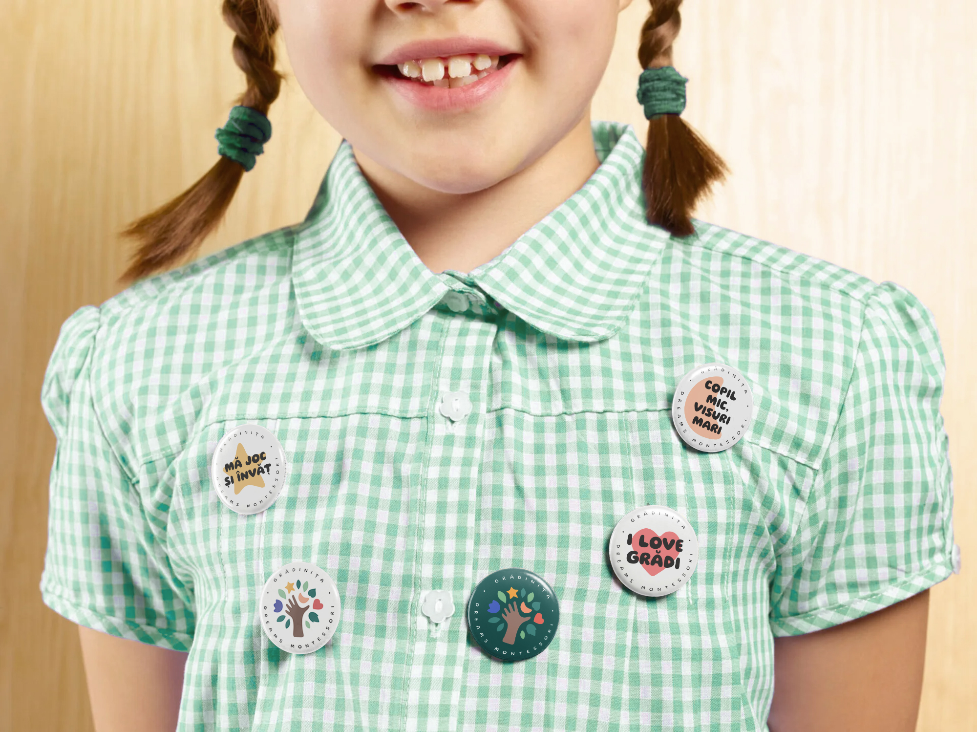
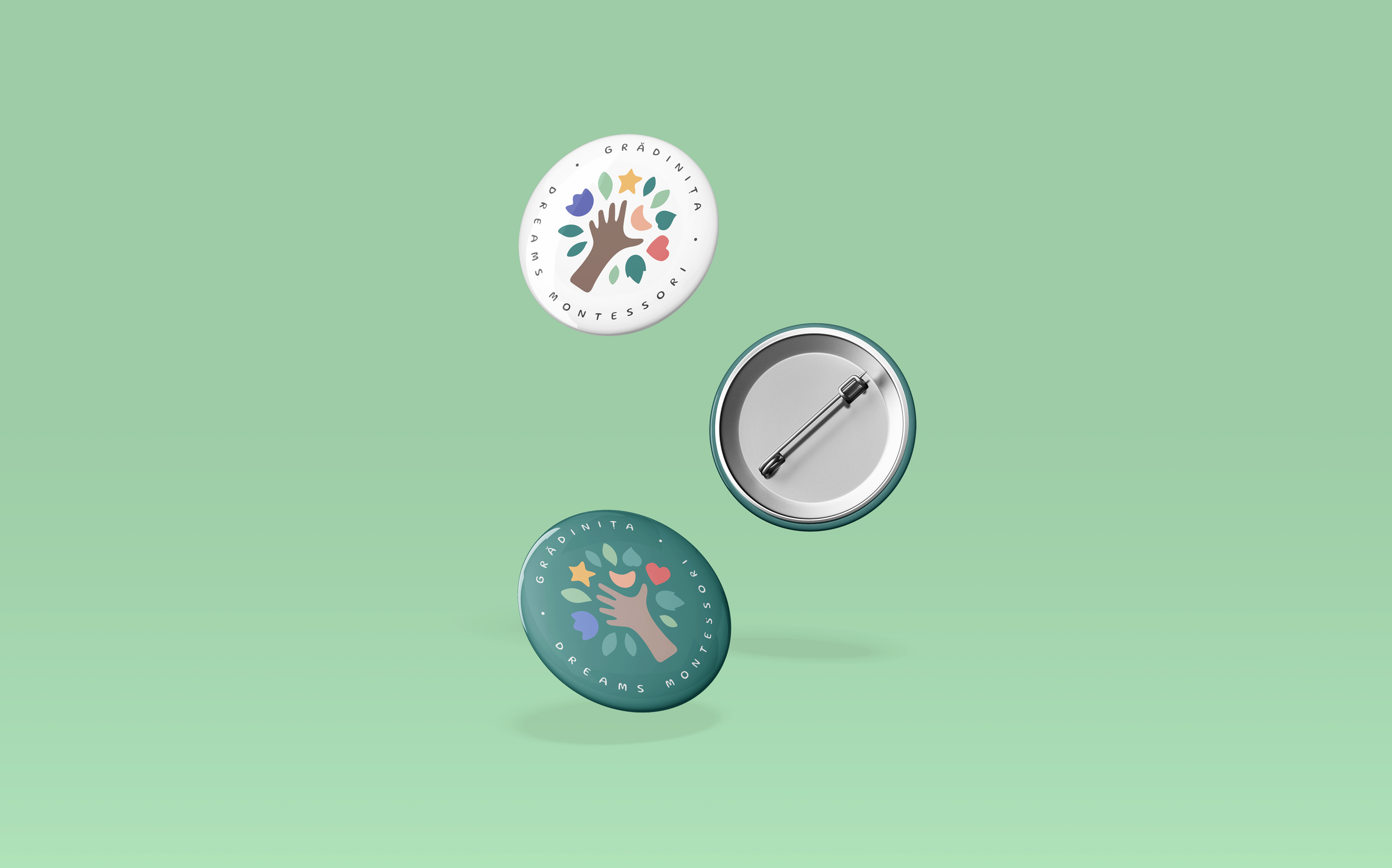
The client wanted a logo that would represent the Montessori concept in education – learning through experimentation, closeness to nature, fulfilling dreams, joy, enthusiasm. I created a colorful, cheerful, optimistic, organically outlined logo, with a somewhat double meaning – it is a hand reaching out to several elements that symbolize love, nature, beauty, dreaming – representing the aspirations of children -, but it is also a tree whose fruits are those elements – as a symbol of growth, evolution, but also of closeness to nature.
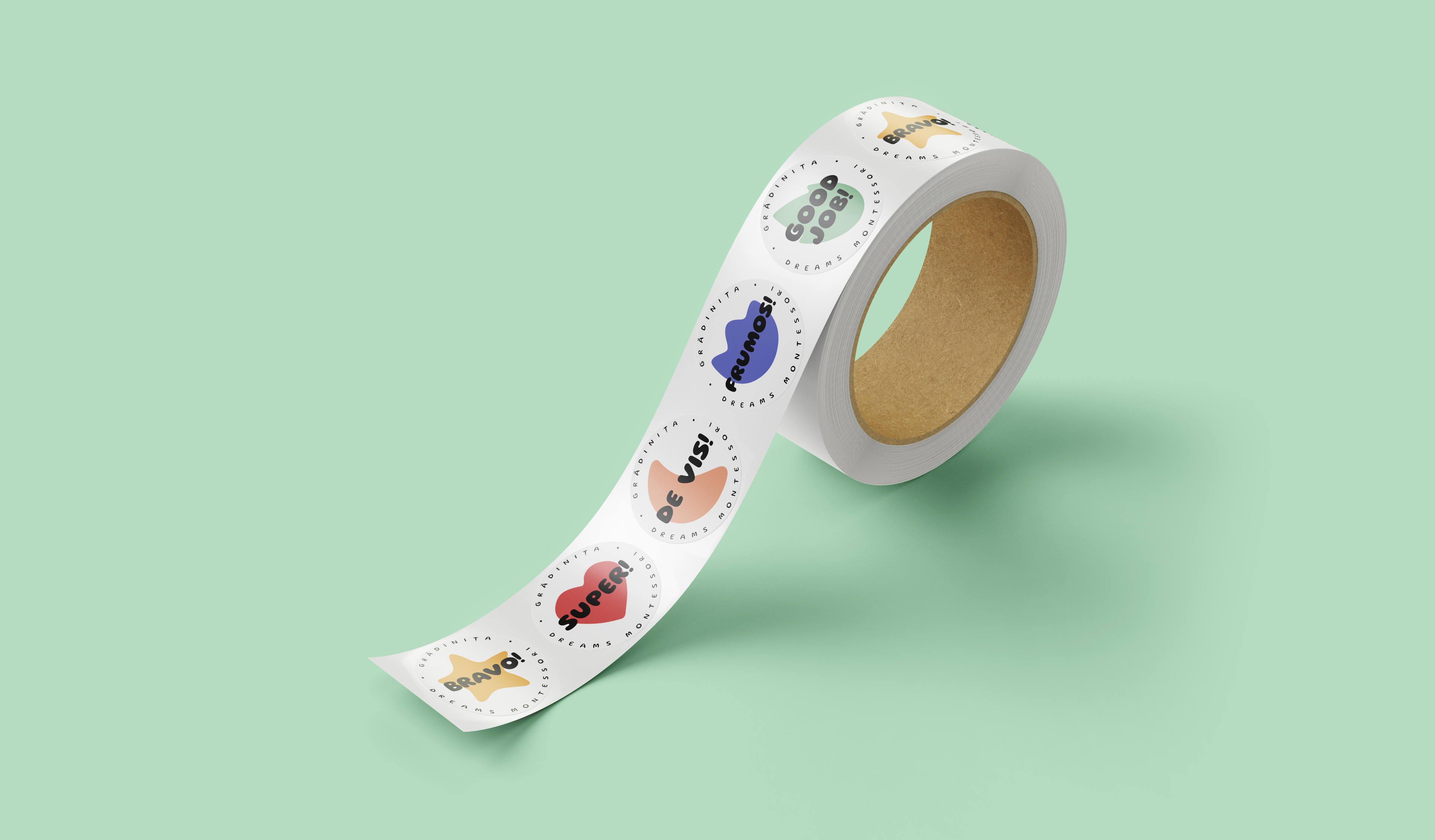
The design system is based on these small symbols in the logo that are to be used in materials in various creative ways.
Prima Solis
Branding, website
For: Digital Partners
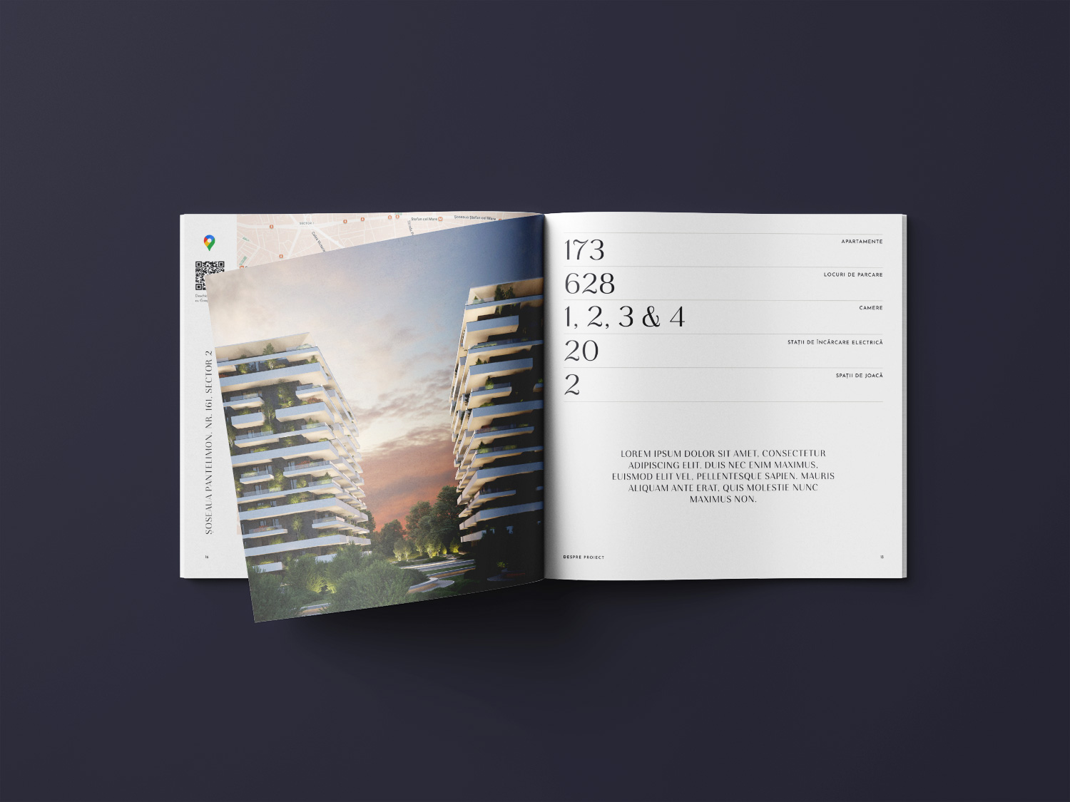
Prima Solis is a high-end real estate complex built in eastern Bucharest by Prima Development Group.
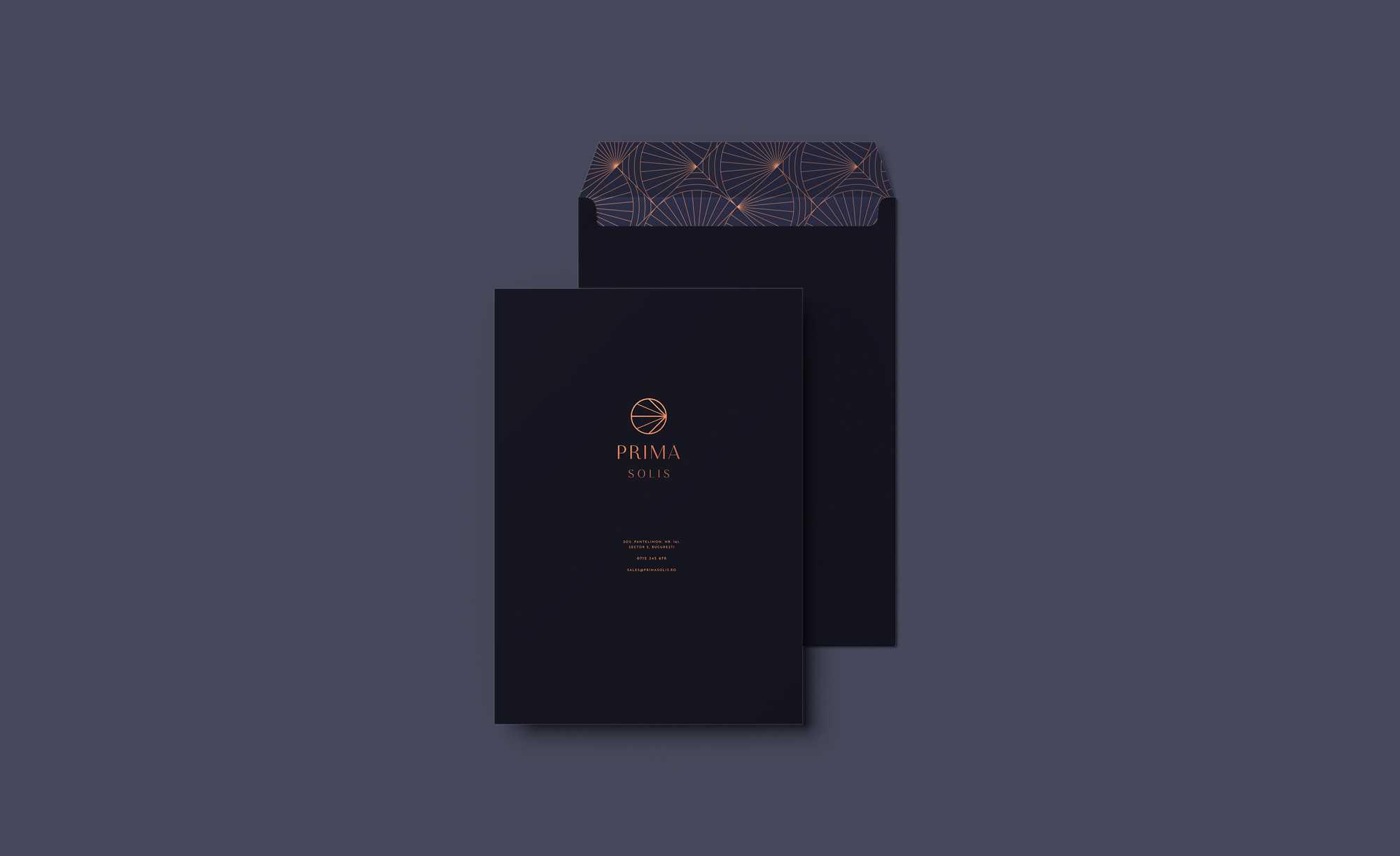
The client wanted a branding that would reflect the personality of the building and resonate with a medium-high target audience: premium, elegant, simple, contemporary, aspirational. I created a minimalist logo, but with multiple meanings: the rays starting from the right of the symbol represent sunrise or east, referring to the positioning of the building in eastern Bucharest; the rays also hide an arrow pointing right or east – also a reference to the location of the building.
I chose to frame the logomark in a circle in order to create an additional connection with solar symbolism, but also because the circle is the most harmonious shape, as well as the easiest to fit into various spaces.
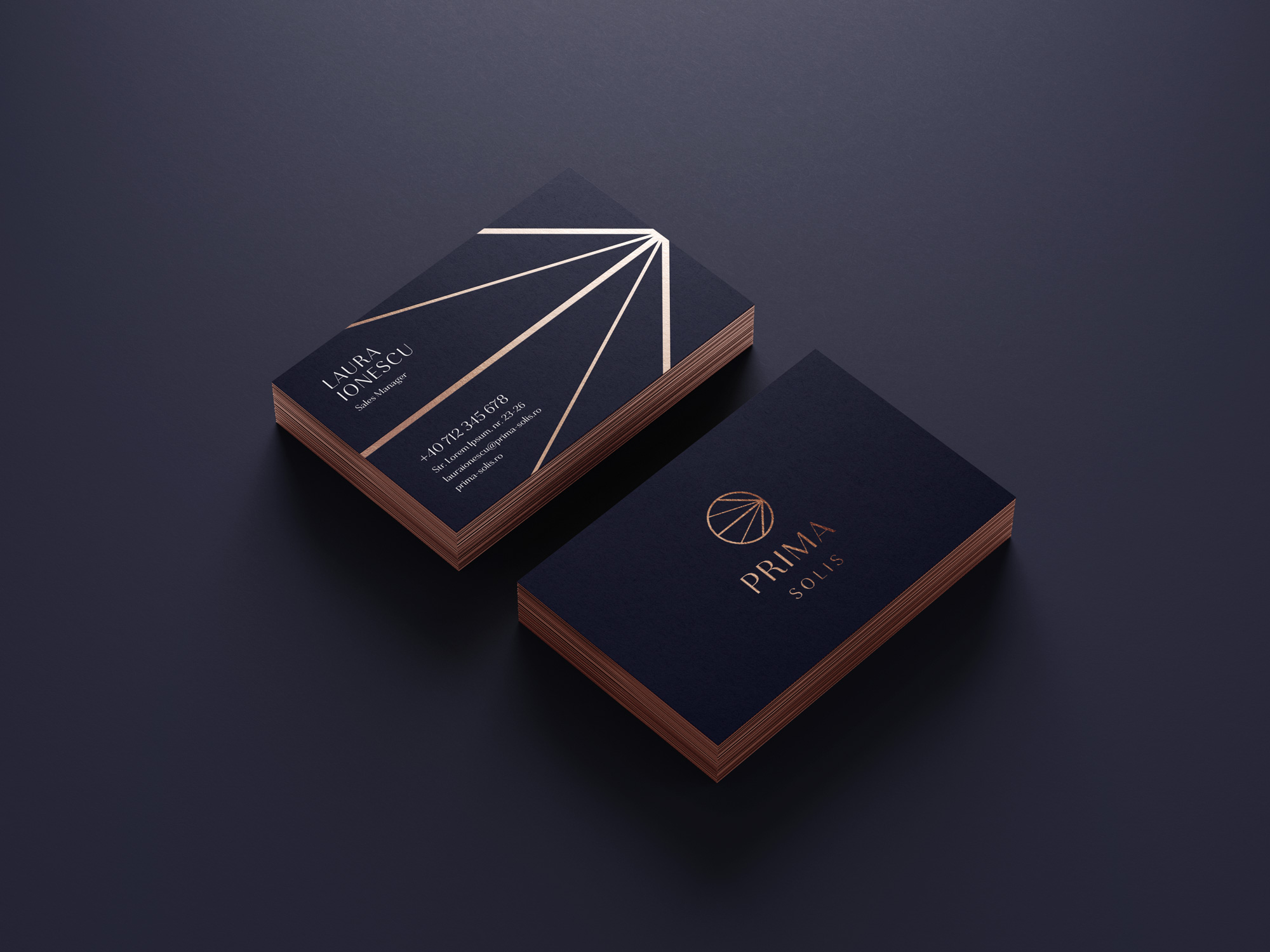
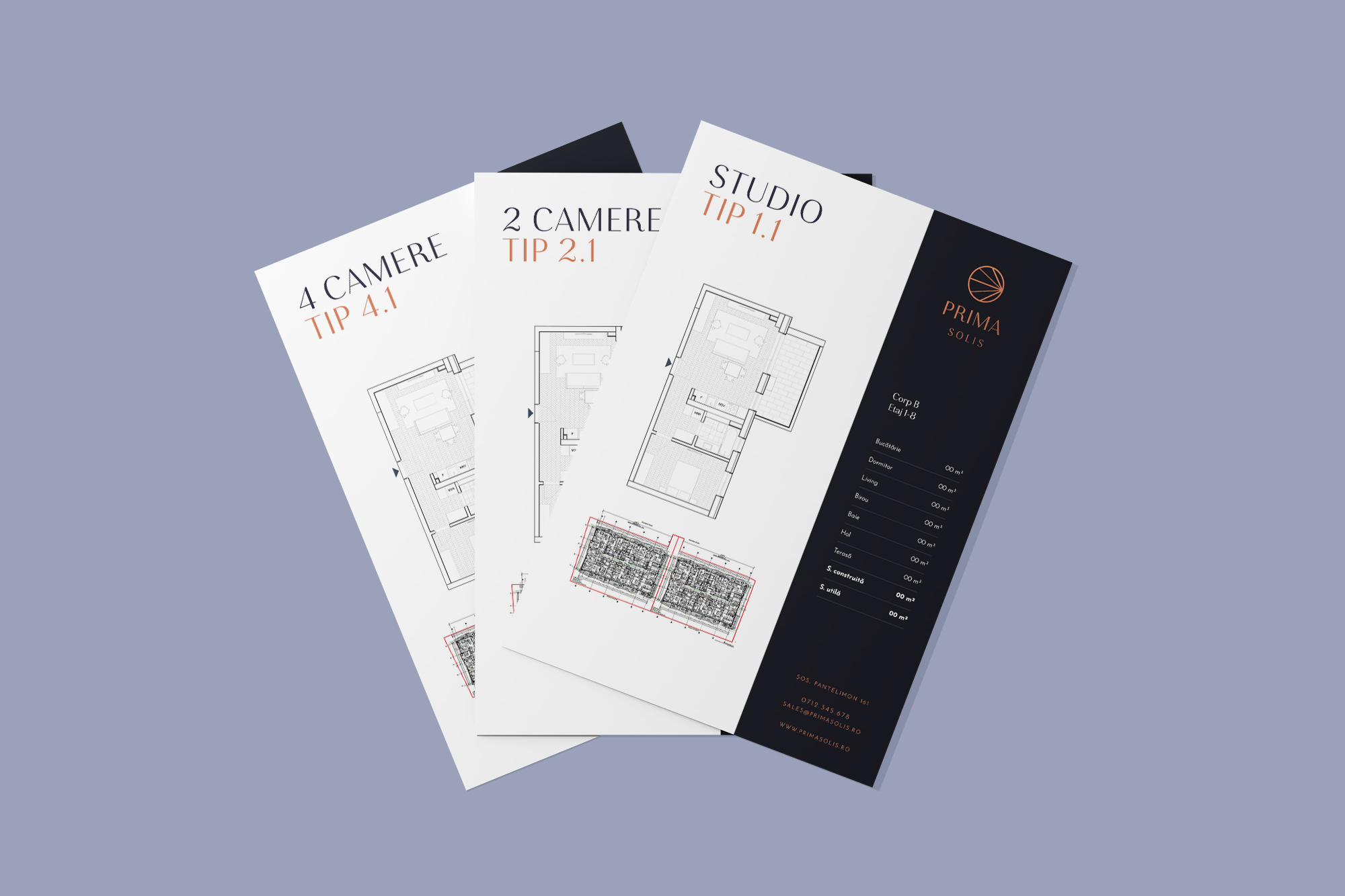
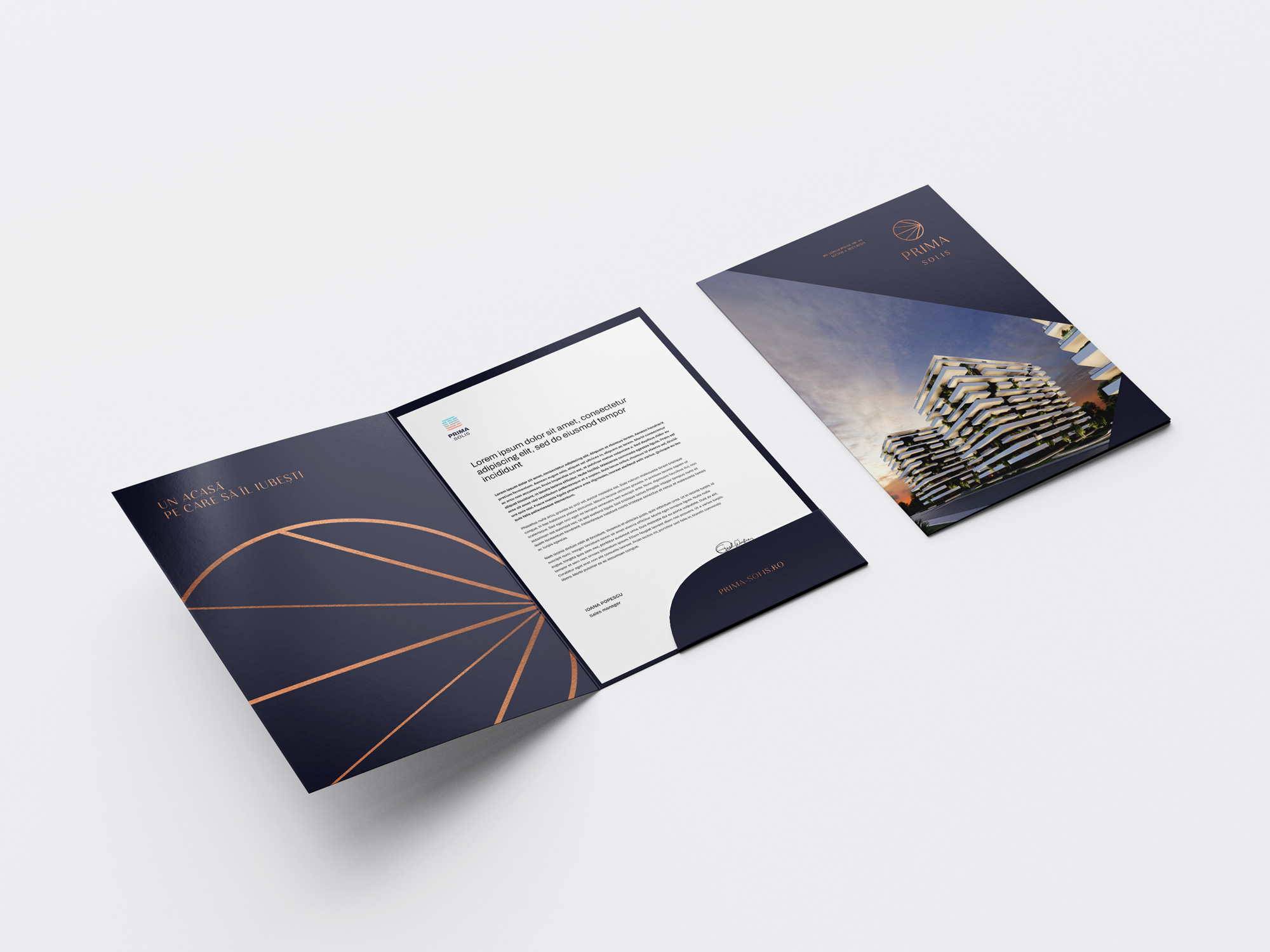
The chosen font is simple, but elegant, with personality, and the color palette is also minimalist, but impressive through the use of copper folio finishes.
Logofolio
Various logos and concepts
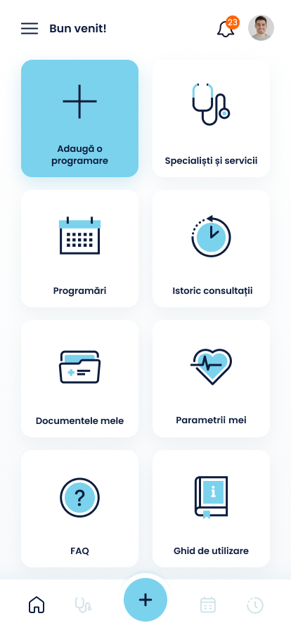
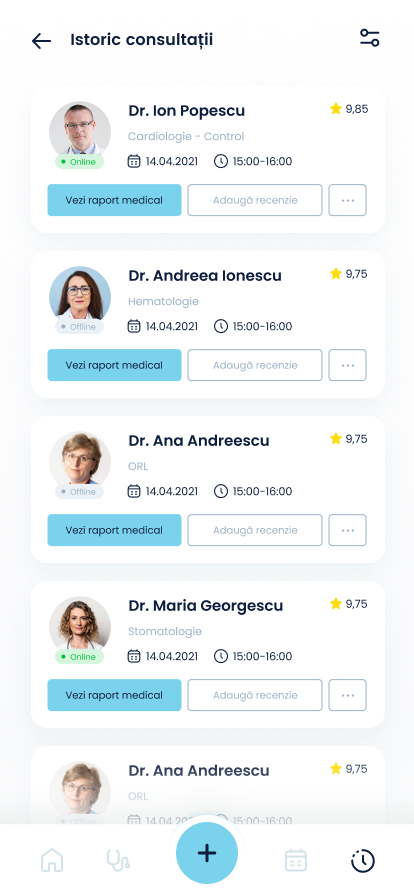
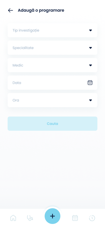
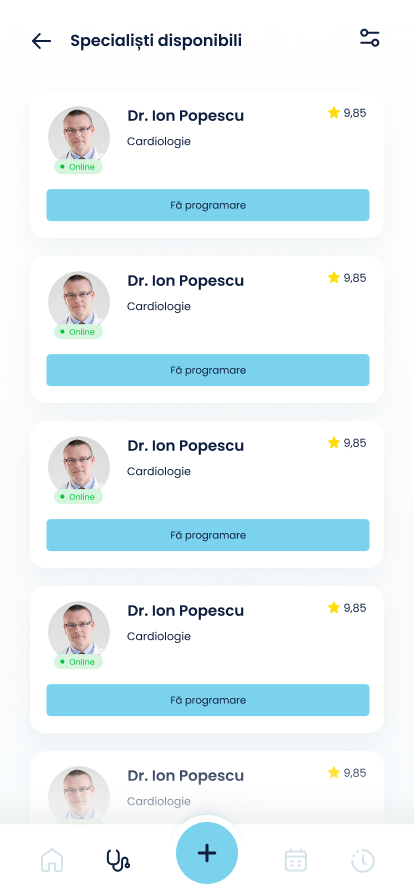
Telemedicine app
UX,UI
Client: undisclosed
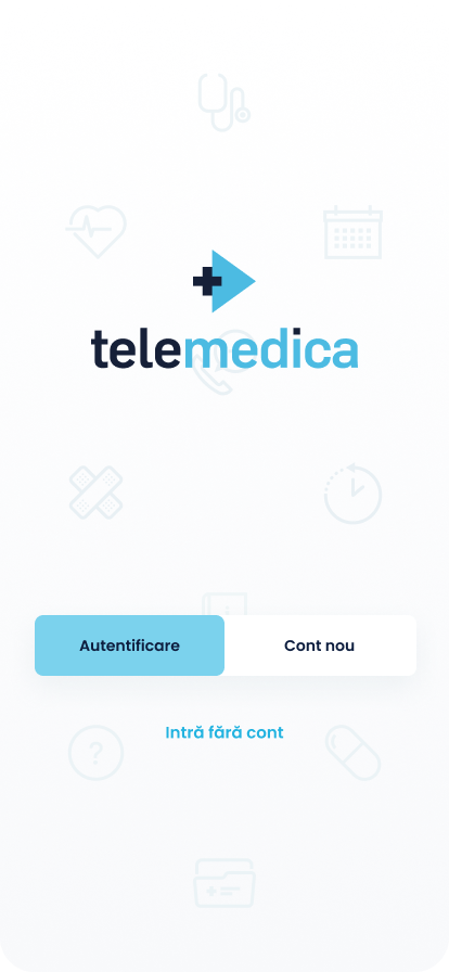
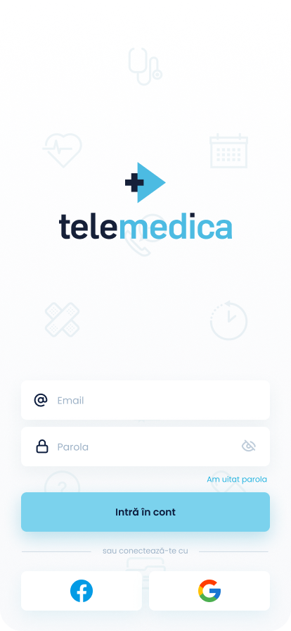
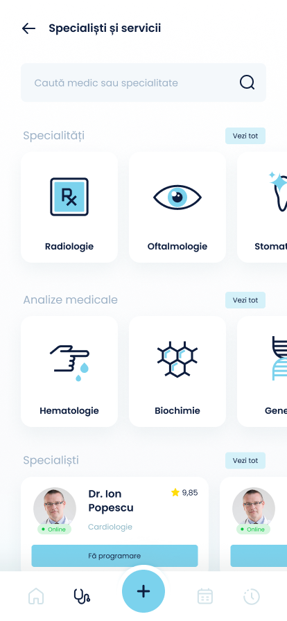
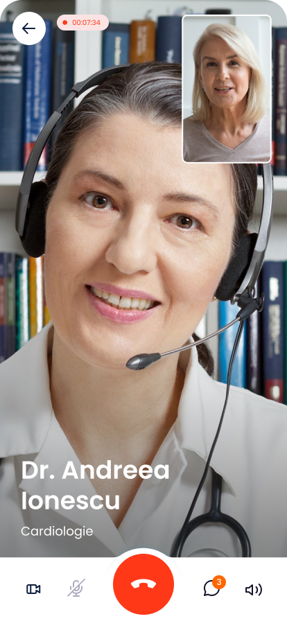
In the context of the 2020 – 2022 pandemic, the client wanted a white-label telemedicine mobile app, with the intention of selling it to medical clinics.
UX CHALLENGES:
- a simple and intuitive user interface, which is attractive for patients as well as medical staff;
- creating a coherent icon set throughout the app.
Various websites
UX,UI
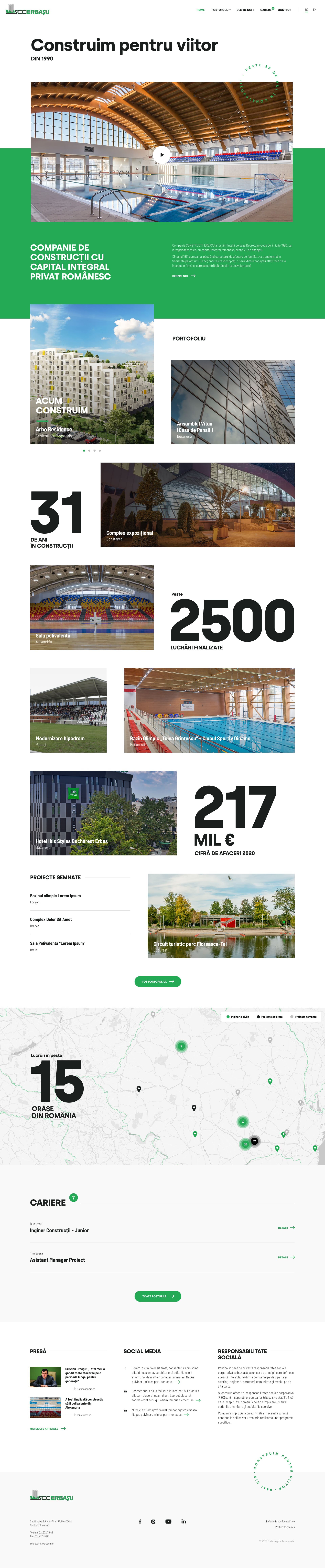
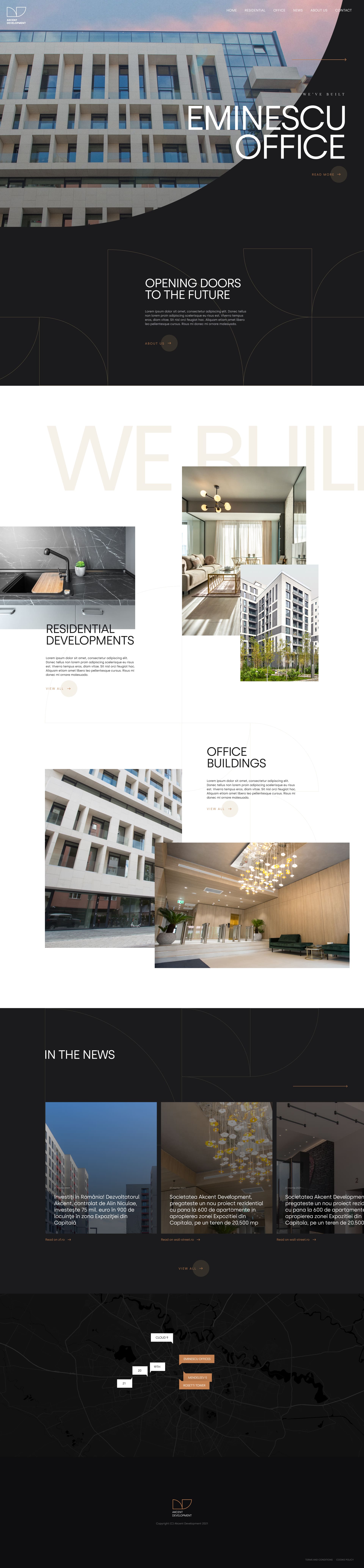
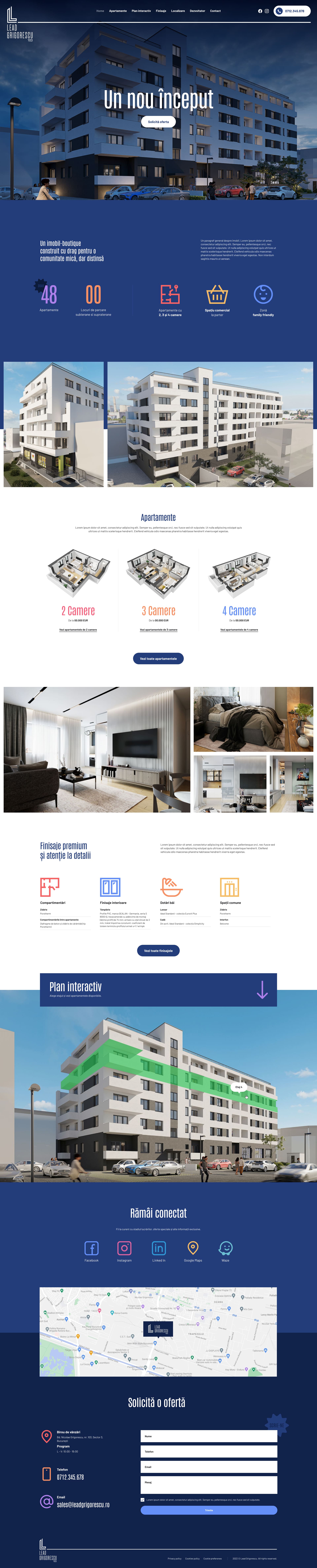
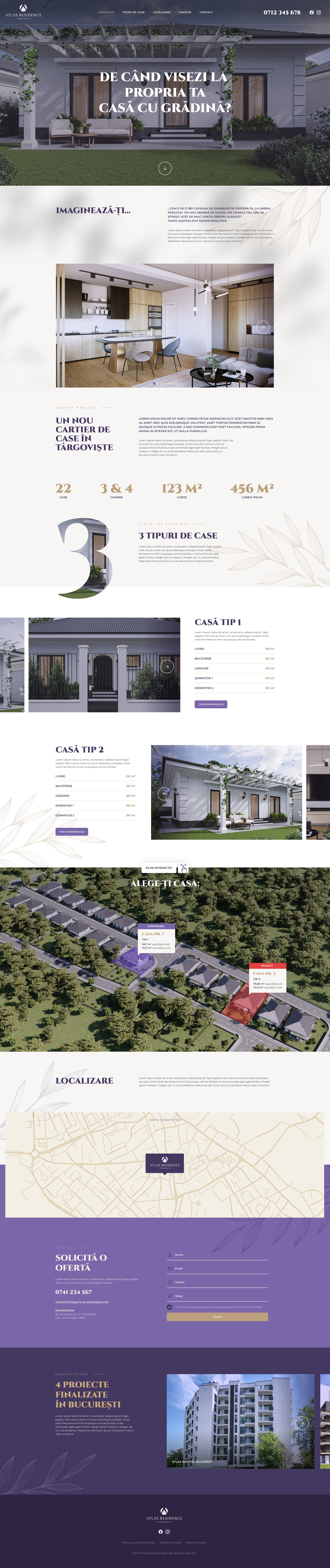
Clienți: Construcții Erbașu, Rădăcini Estate, Akcent Development, Akcent City, Sopra, One66, Body Art etc.
Various web design projects, mainly for clients in real-estate.
The Nest Address// Uite barza!
Design & UX app mobil
Client: Enel, SOR
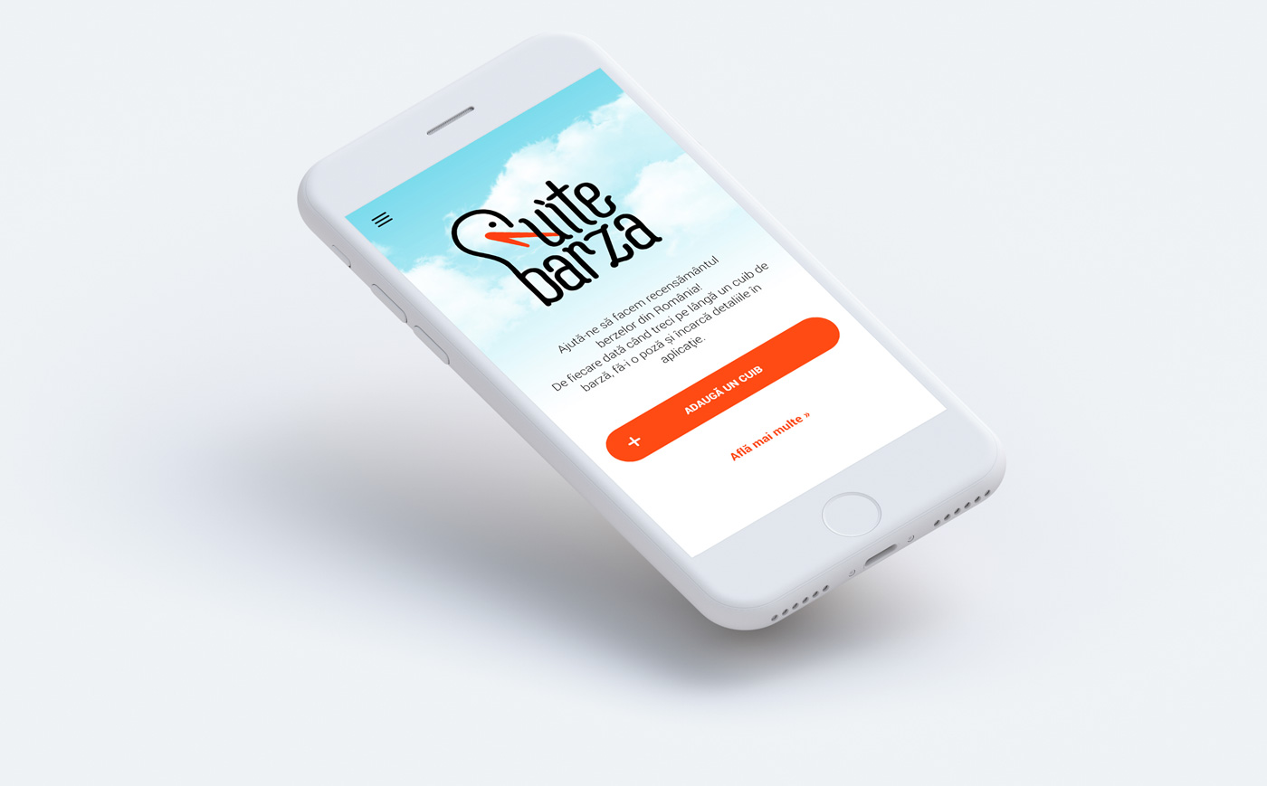
The Romanian Ornithologic Society (SOR) launched a national stork census, in partnership with energy provider Enel. One of the objectives was to prevent accidents with storks building nests on top of electricity poles.
In the app, users would mark poles where they see stork nests. In case of necessity, the Enel technical teams would know where to intervene.
UX CHALLENGE:
- a simple and efficient app, because bird watchers are not necessarily the most tech savvy users.
Closer to nature
Creative idea,Art direction,UX
Client: Napolact
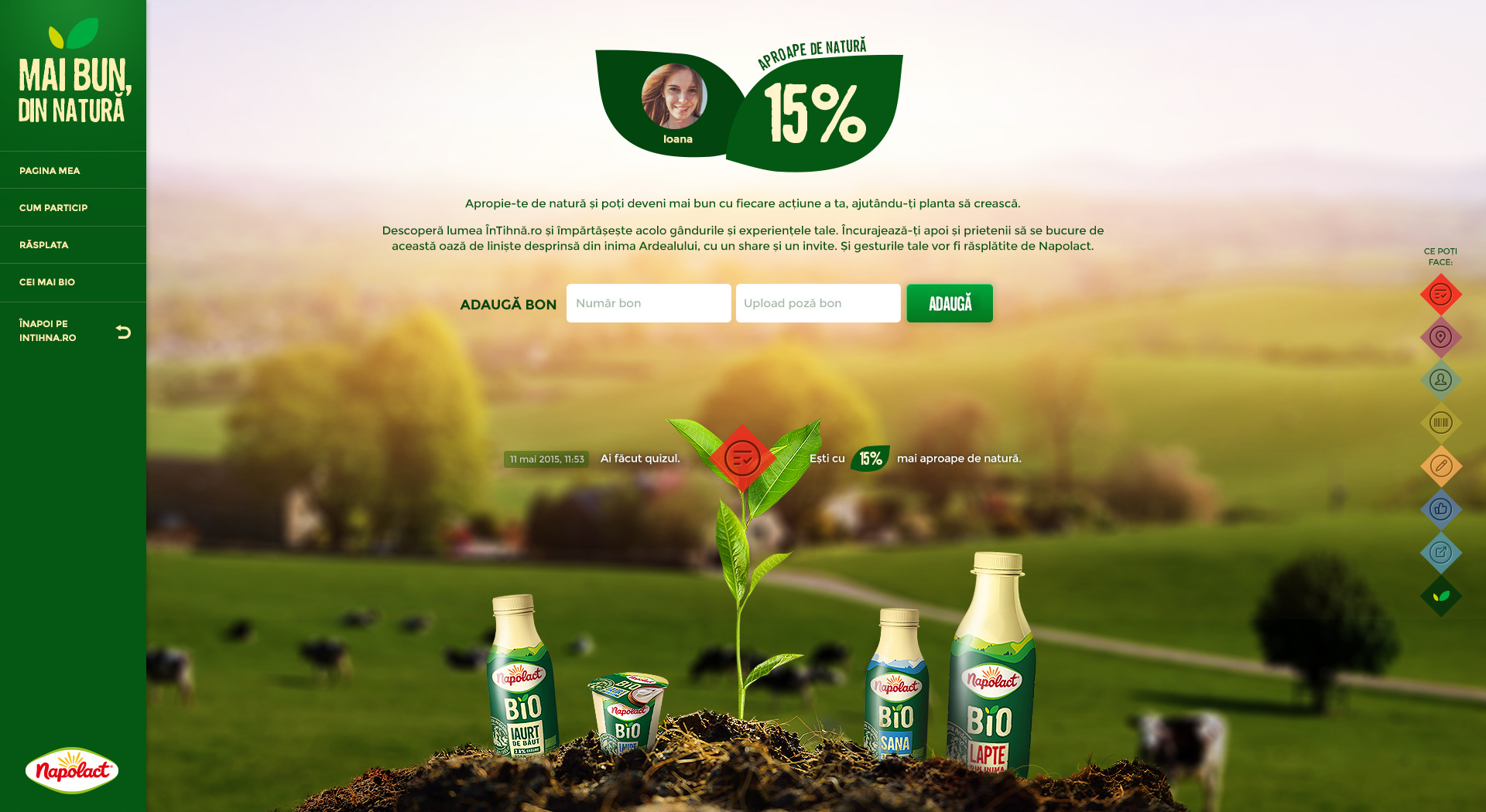
Dairy producer Napolact wanted a digital platform in light of the launch of their new line of bio products. The creative team that I was a part of came up with the campaign called Closer to nature.
To suggest that the Napolact bio products are more natural, we created the website intihna.ro, where users would get a little closer to nature even when in front of the computer by doing various actions on the platform.
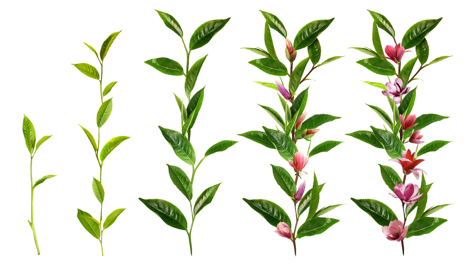
We needed a visual representation of the „closeness” to nature, so I came up with the idea of having a digital plant what would develop the more a user would use the platform.
UX CHALLENGES:
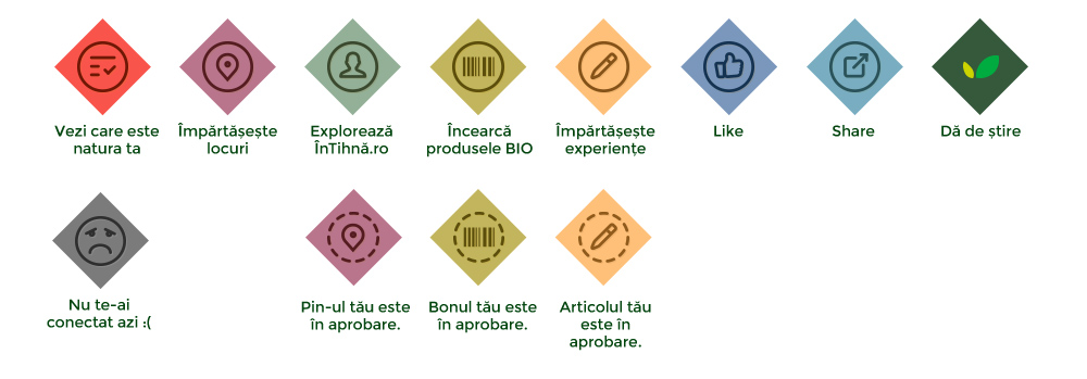
- finding a creative way of showing progress;
- keeping users’ interest during the campaign.